User-Centered Design
The Launch
Background
In 2018, we were challenged with creating a space-themed game that could be used as a communication tool to inspire corporate-level board members and executives to step out of their comfort zone and take a more creative approach to decision making.
How do you get executives to to role-play a SciFi game during a conference?
Randy Harrington, Ph.D., had confidently asserted that he would be using the game during a real conference the following month. No matter what, we needed to design, test, and deliver a product in 6 weeks.
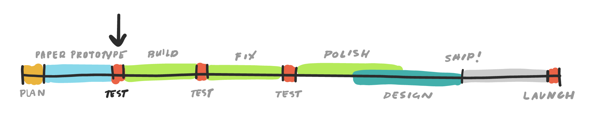
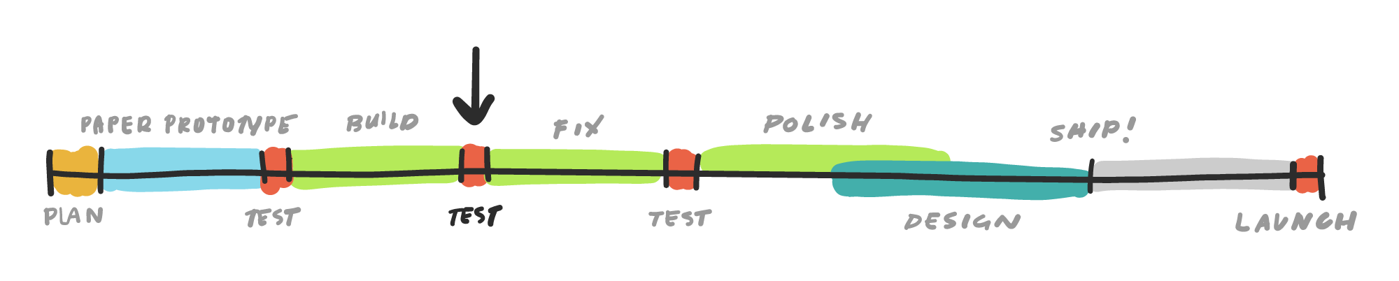
A typical product development cycle normally consists of thorough discovery and design phases, followed by a single development phase (or time permitting, iterative dev cycles).
Unlike typical projects, we were given complete creative freedom to define what we were going to build and how we were going to build it, as long as the final deliverable was an engaging user experience.
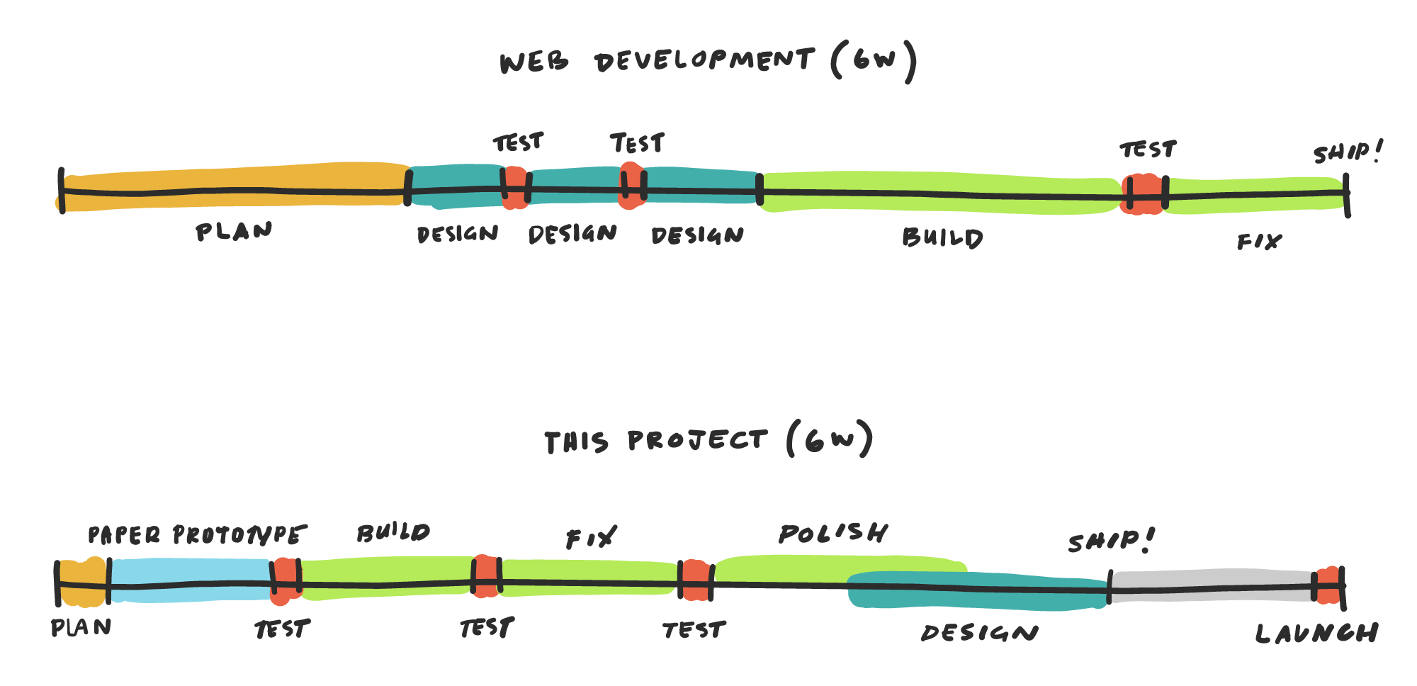
Instead of following our normal software development process, we approached the project like a hybrid of a UX project and a hackathon. That meant ultra quick planning, thorough user testing, rapid development, and ad-hoc visual design. Above all else, we needed to prove that our game concept was viable. We needed to strategically engineer fun.
The Challenge
We had 6-weeks to build a game.
We needed to design an engaging space-themed game in less than 6 weeks that would be:
- Simple, so that participants understand the game objectives immediately.
- Inferential, so that participants develop insights about strategic planning through the game.
- Flexible, so a facilitator can make adjustments to the game setup, duration, and wrap-up.
- Scalable, so the game can be played with an audience of 4 to upwards of 100 participants.
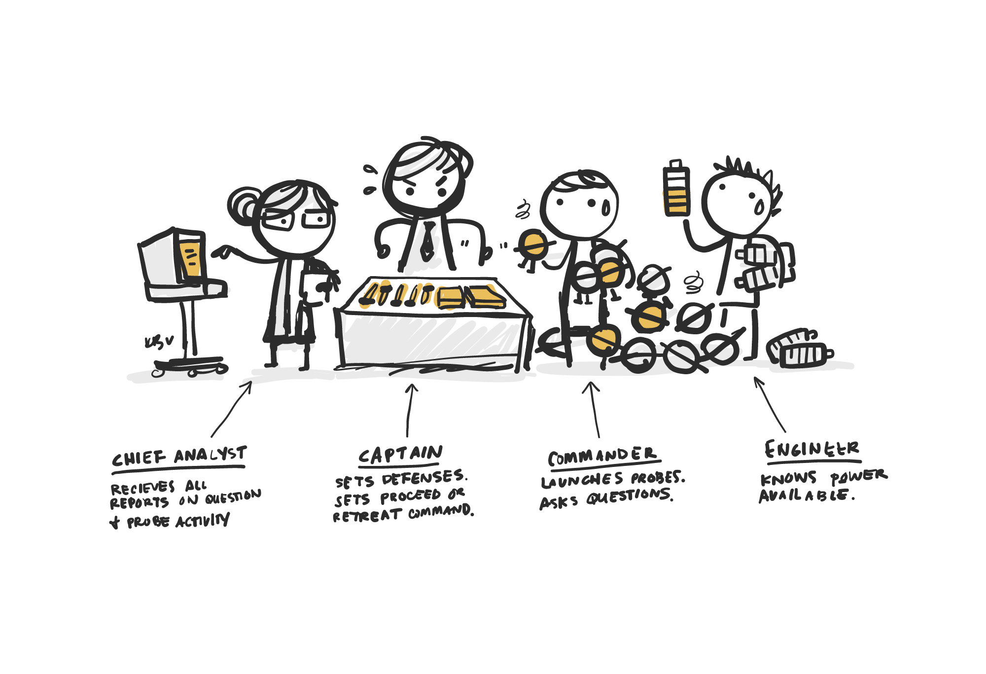
Our Team
Jon Borgonia, Project Lead, Senior Architect, Test Group Moderator
Kelli Borgonia, Game Designer, UX / UI Designer, Project Manager
Te Vallee, Full-Stack Developer, SFX
My Role
For this project, I designed the game economy and script, developed the game’s overall UX and UI, and served as the project manager during the software development phase.
Brainstorming
We imagined science fiction as reality.
We watched Star Trek. We played co-op board games. We analyzed what made question-based deduction games like Spyfall successful. We were especially inspired by the co-op mobile game Space Team.
We expanded on Randy’s concept that players need to ask questions and launch probes to investigate the possible hazards of space.
We did our best to ensure that our game was simple, thought-provoking, and technically viable to build in the timeframe available.
Notes on game UI, logic, intended outcomes, and software development.
Organizing all of our ideas, we mapped key game mechanics, player actions, and all possible win/lose scenarios to potential player insights.
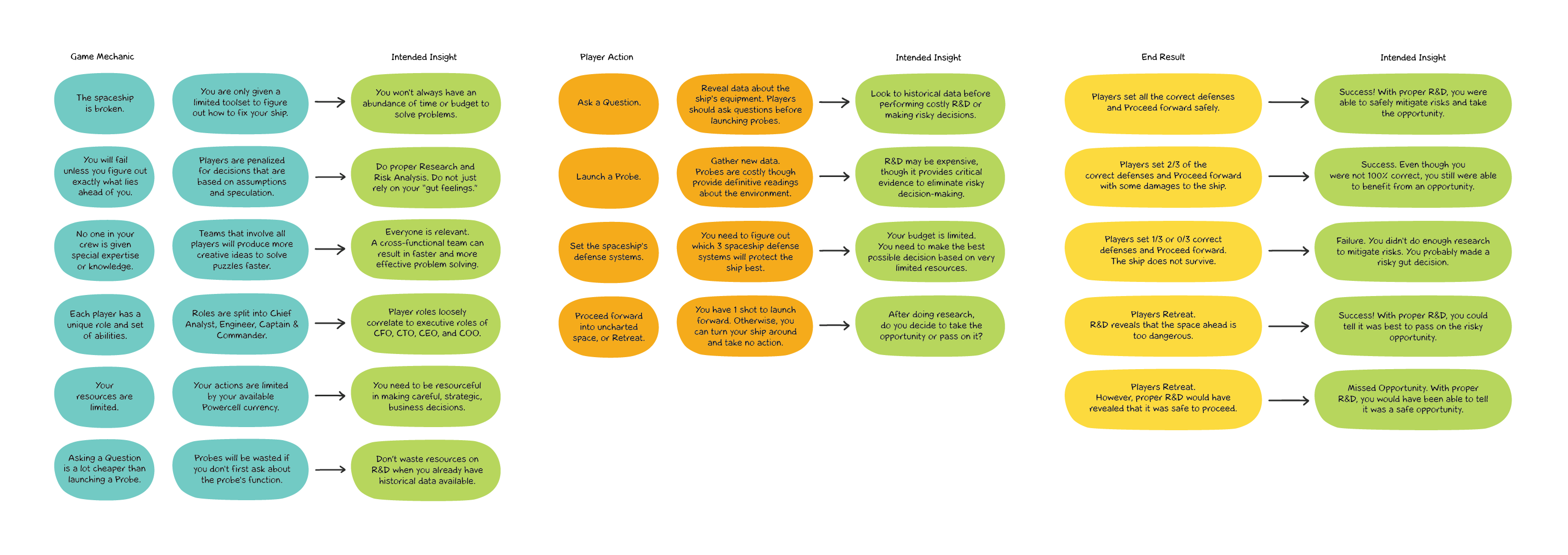
Game mechanics, actions, and win/lose scenarios mapped to player insights.
The Game Concept
Four players would be assigned different roles aboard a stranded spaceship. Together, they must analyze their environment, enable a limited number of ship defense systems, and decide on whether it was safe to proceed, or better to retreat from danger.
How we imagined it would feel to play our imaginary SciFi scenario.
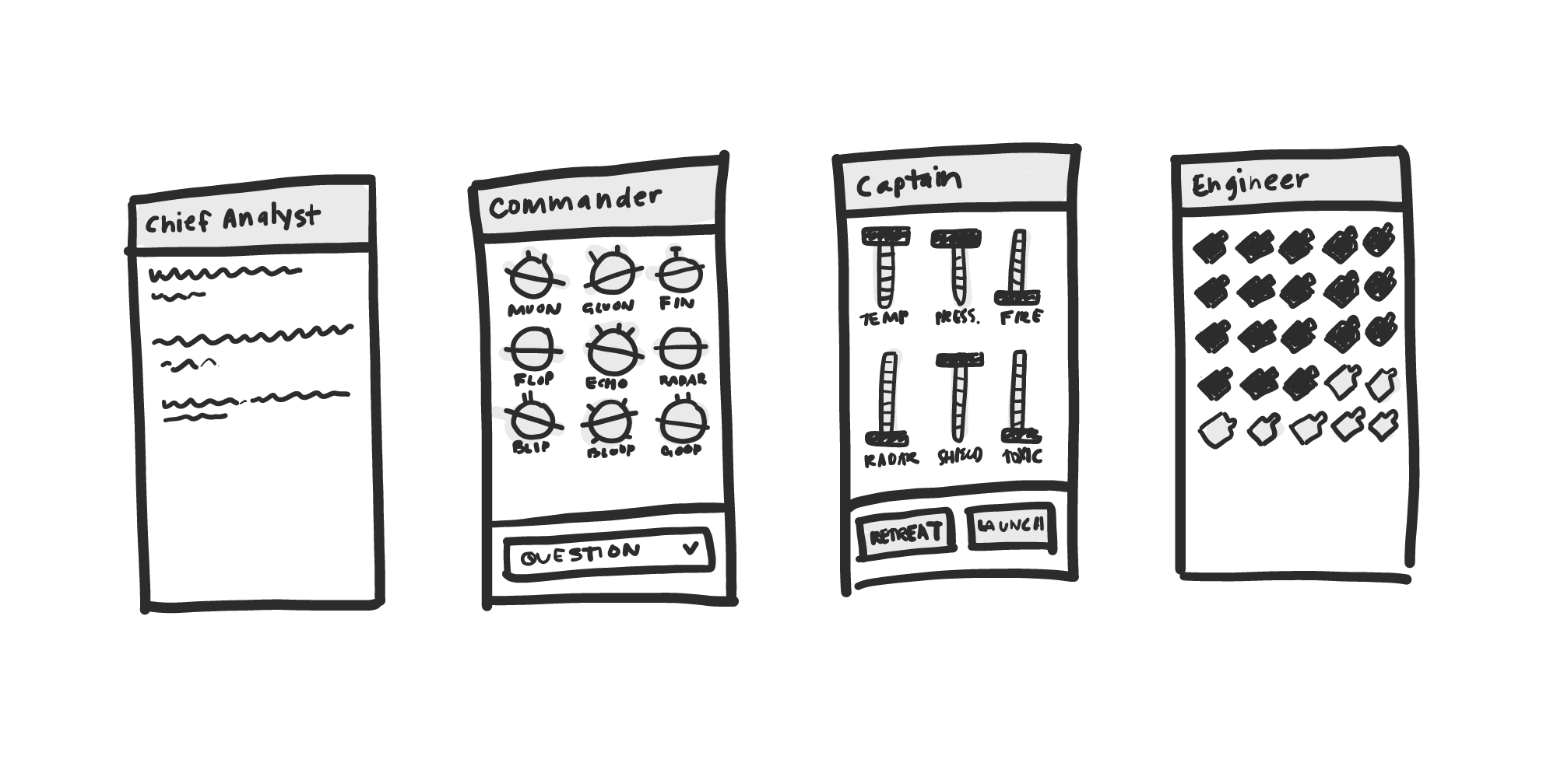
Mockups showing the player actions split into different game UI screens.
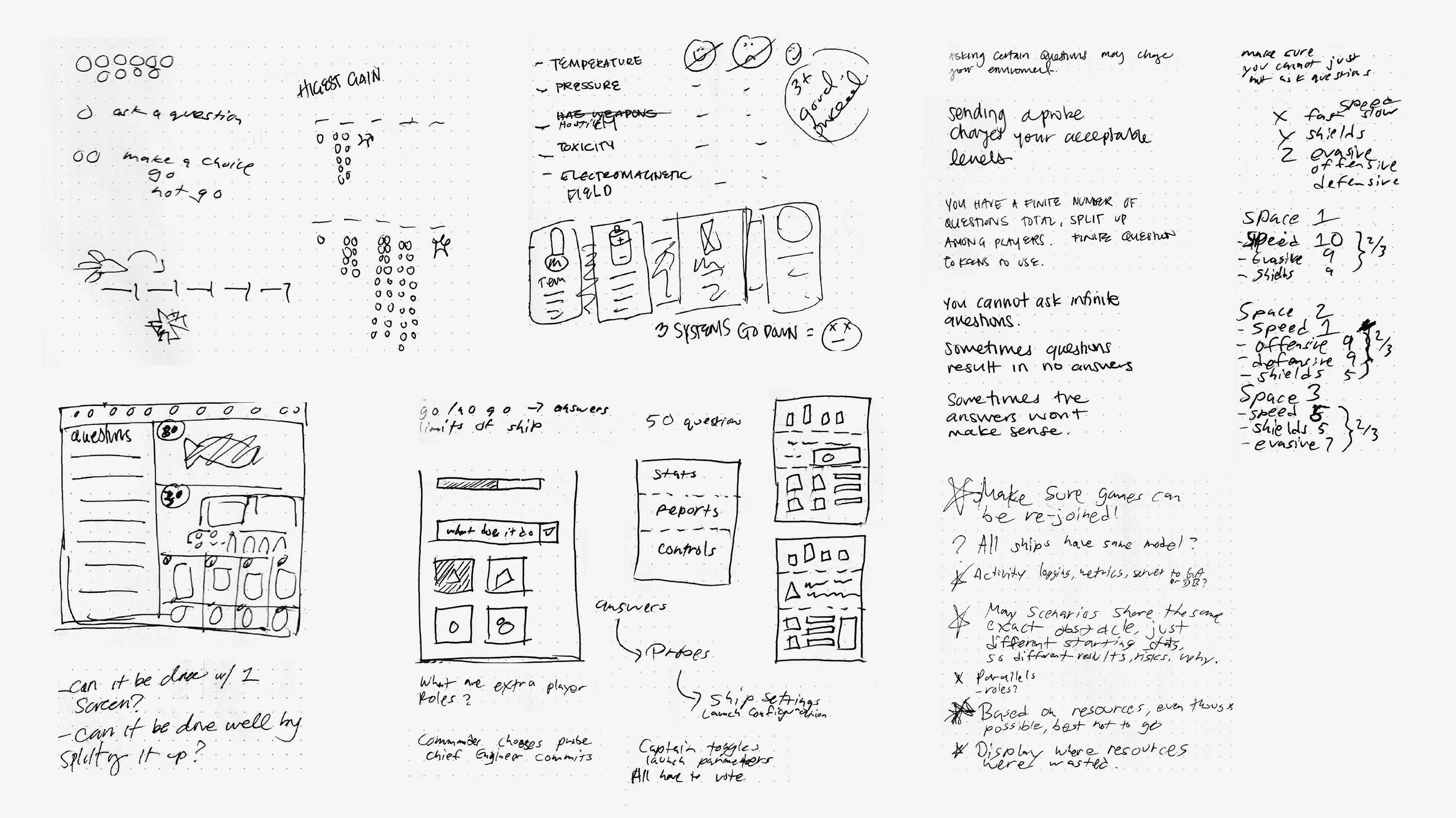
I created a game economy where “powercell” units could be spent to ask questions or launch space probes. In this case, “design” was completely non-visual and instead consisted of a giant map of logic statements and game properties mapped out on a spreadsheet.
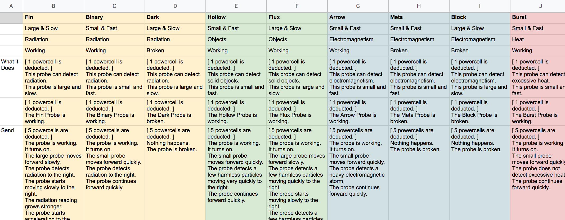
A snippet of the game economy and logic mapped out on a spreadsheet.
We had designed all the basic components of a game, though we needed to test our idea as soon as possible to validate if it was actually fun.
Version 1
We translated the digital UI into a quick paper prototype.
We intended for the game to utilize mobile phones, so I cleaned up the mockups and created low-fidelity paper prototypes of the game UI. Elements that would later be programmed game functions were simulated using various game tokens and cards.
Digital components converted to a paper prototype for the first user test session.
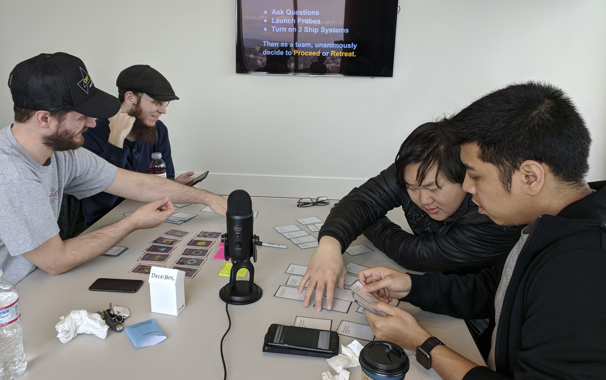
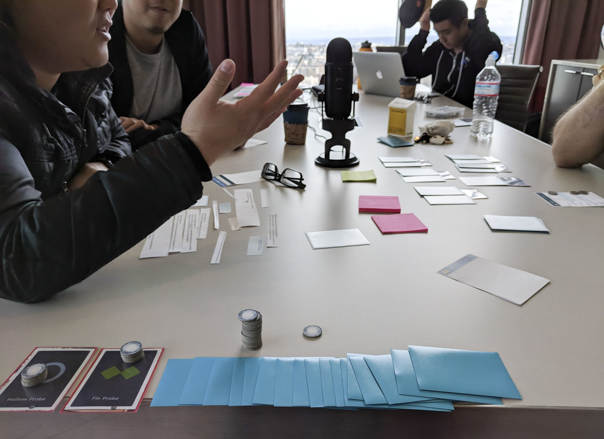
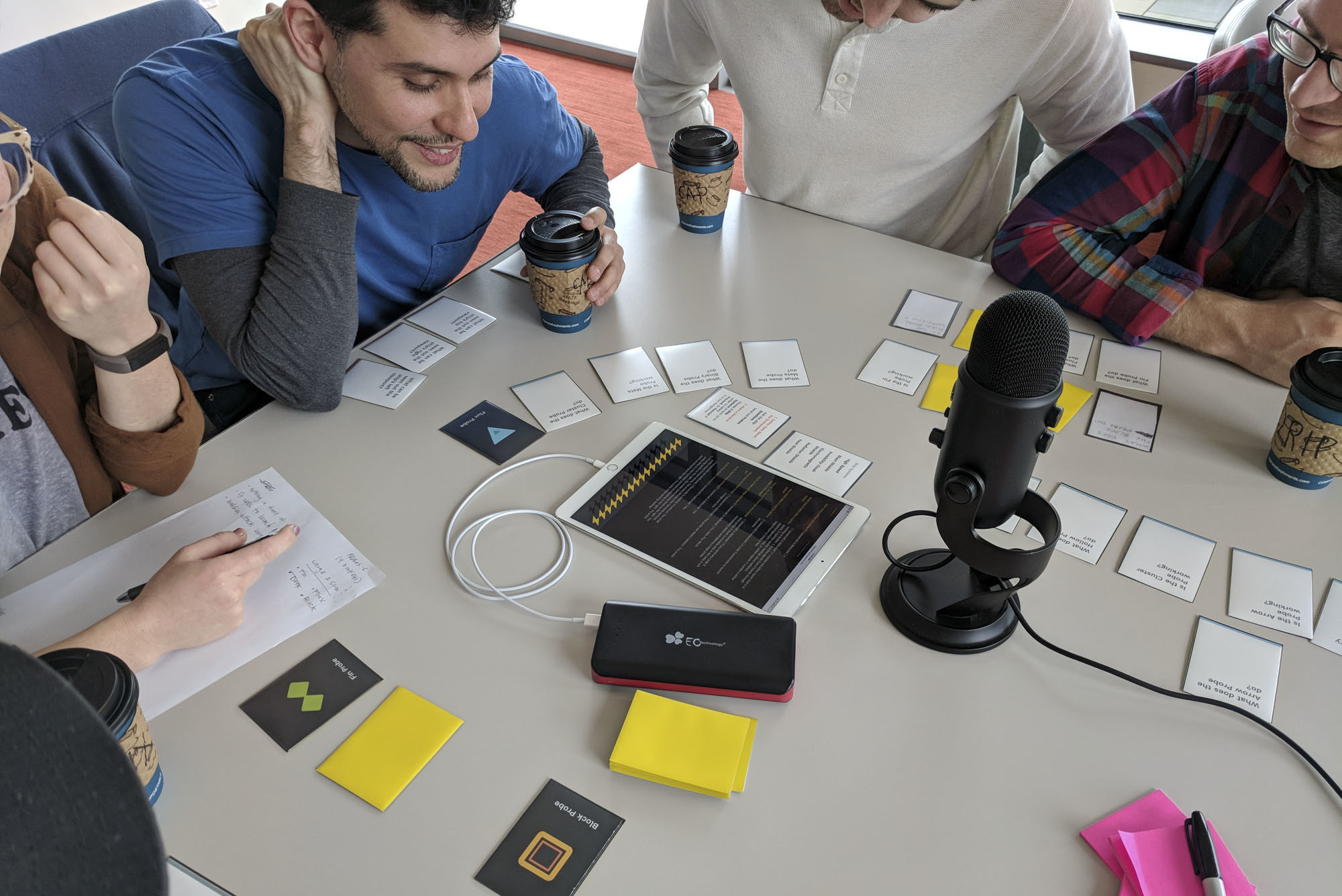
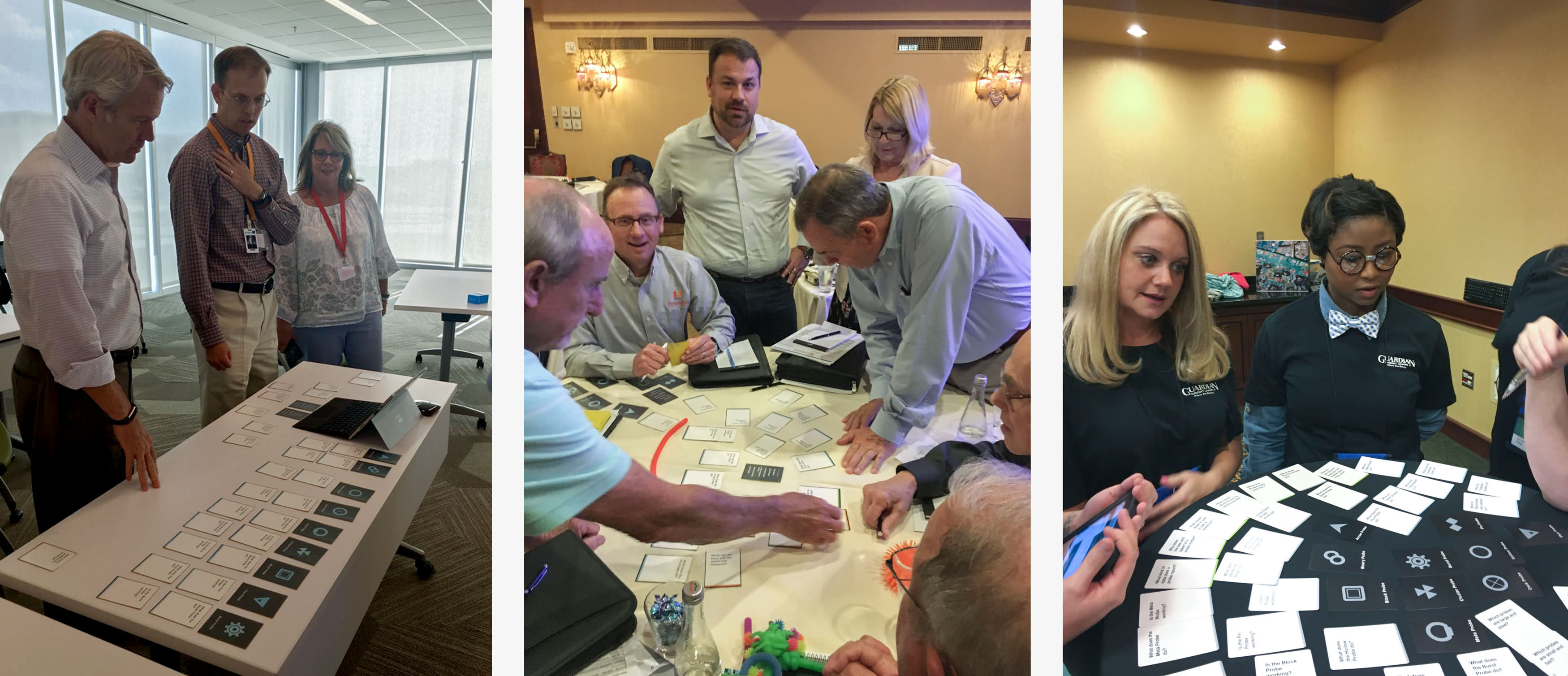
Test Group A
We gathered a group of 4 friends to test our game on a Saturday morning. Jon set up the game and captured an audio recording of the entire session so we could review it later. We silently watched and both took notes as the game played out.
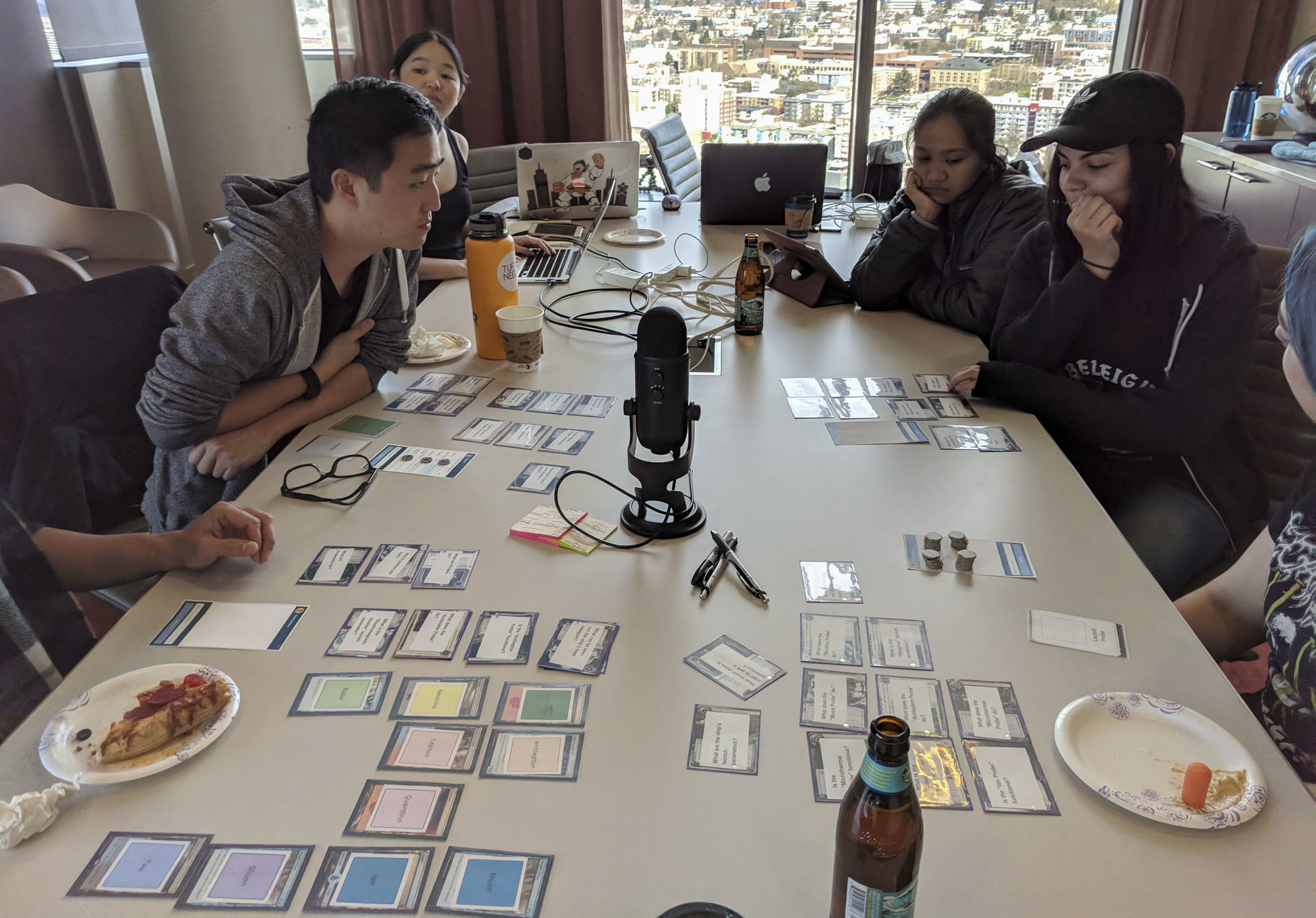
Thank you Alan, Laura, Te, Jen, and Justin!
Paper prototypes and repurposed board game tokens.
We found that physical cards were a critical asset in driving user interaction.
Users generally seemed to understand the game objectives and were fairly vocal throughout the game. There were moments of confusion, frustration, heated discussion, relief, and finally triumph when they successfully completed their space mission. After the game, Jon led a short discussion to gather feedback.
The most surprising observation was that players used the question cards to sort and organize information. We weren’t initially planning to create any physical cards for the final game, though it seemed that the physical game cards were a critical asset in driving player interaction.
Things that worked
- Unlimited time allowed players to make thoughtful decisions.
- Players were very engaged.
- Question cards were an unexpected success.
- Players left feeling enthusiastic and triumphant.
- Players commented that they “kept thinking about the game” and wanted to play again.
User frustrations
- The names and colors of probes were unnecessarily misleading.
- Prior knowledge of science fiction led to incorrect assumptions.
- Subtle wording choices misled players about environmental factors.
- There were too many ship defense systems to choose from.
- Players did not feel enough pressure to conserve resources.
- Question Cards were difficult to sort.
- There was a lot of extraneous note-taking for basic game facts.
Things to improve
- Rename probes so they are not misleading.
- Explicitly state that players should not rely on prior knowledge about space.
- Adjust wording in story content for clarity.
- Decrease the total ship defense systems. Remove “weapons” so the game focuses on defensive strategic planning.
- Decrease the amount of “powercell” resources.
- Provide physical cards that players may obtain so they do not need to take notes about basic game facts.
- Formalize the cards to be an intentional part of the game.
How did we do?
PassedSimplePlayers understood the game objectives.
PassedInferentialPlayers expressed insightful comments at the conclusion of the game.
UnknownFlexible?We need to build a working proof of concept to know for sure.
FailedNot ScalableThe paper prototype is not scalable. We need to digitize the physical game elements.
Version 2
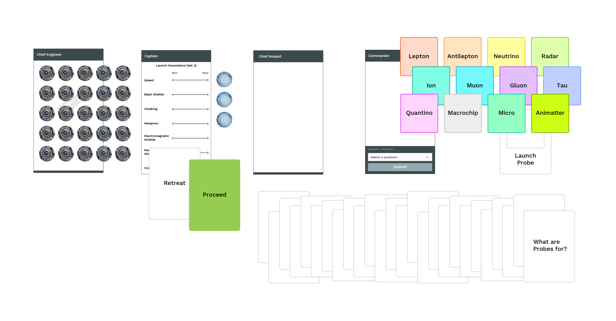
We rapidly built a working UI.
We preemptively set up our second test session for the following Saturday. This gave us 1 week to build the game UI.
We met up with Te Vallee in person to sync up for our development sprint. During a 6-hour hackathon-style Sunday sprint, we were able to complete about 60% of the core game logic and UI.
Version 1 mockups showing 4 player roles and various game outcomes.
Jon tackled game states and logic. Te worked on building out the UI and controls. I focused on layout, rudimentary styling and Q/A.
At the end of the day, we distributed the remaining tickets to be tracked and completed through Github Projects over the next week. By Saturday, we had a rough imeplementation of the game UI completed.
Test Group B
In our second test group, all players were asked to connect to the game session on their mobile phone. Each user had a unique role with specific actions in the game.
Thank you Brandon, Bob, Sean, and Manny!
We took a wrong turn.
Five minutes after starting the test, we realized that the digital game UI was wasn't going to be effective. Several players experienced technical difficulties in syncing their device to the game. Even worse, participants were staring at their phones instead of looking at each other! This digital version of the game was missing the engagement we were able to quickly build up with the first test group.
We quickly ended the test.
How did we do?
FailedNot SimplePlayers spent too much time studying the digital interface.
UnknownInferential?Technical difficulties prevented players from getting to a point where inferences could be made.
FailedNot FlexibleTechnical difficulties proved that the game was very inflexible.
FailedNot ScalableTechnical difficulties proved that the game was not scalable.
Reboot
Just in case there were technical difficulties, I had brought all the materials from the first game session as a backup. With the same test group, we rebooted the game using only the cards and paper mockups.
Tokens were used for planning ahead and allocating resources.
With physical game pieces, players again intuitively understood what to do. The tactile nature of the cards made it easier to communicate with each other and visually organize information.
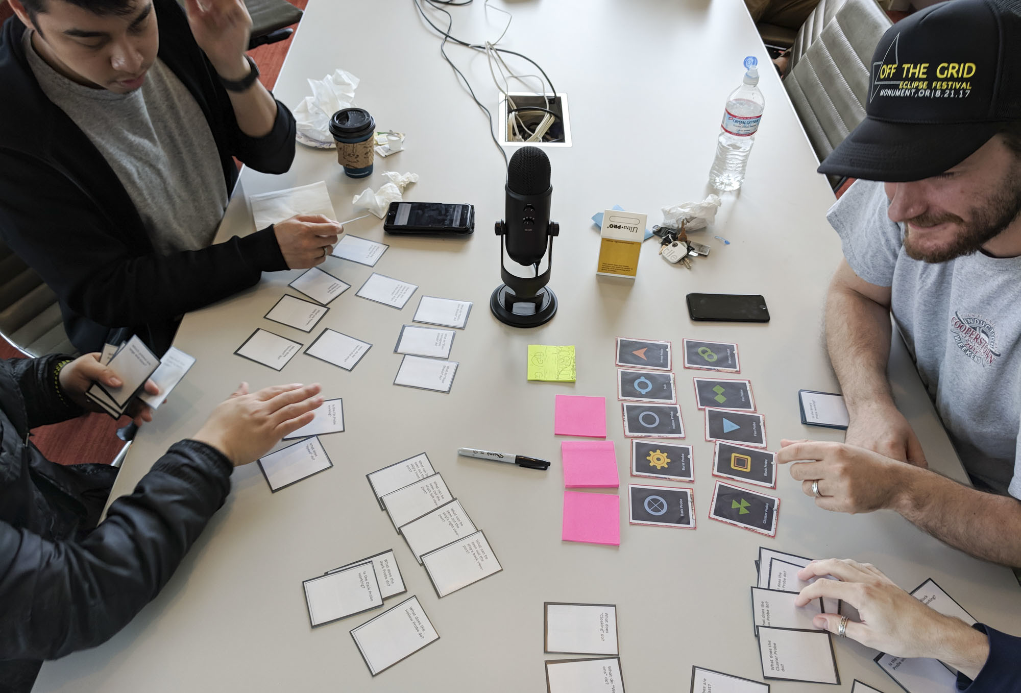
Players spent 10 minutes organizing cards. This was not an intended behavior.
Participants were engaged and excited, and again had a lot of fun playing the game. Revised copy improved clarity about the game rules. We did notice that players spent too much time organizing game elements rather than jumping into discussion, so we realized we would need to do something to reduce this point of friction in game play.
Sometimes the best solution is no-tech or low-tech.
Our most important takeaway: the game didn’t require a digital component. The core game was still based on cards.
Things that worked
- Clearer setup instructions eliminated assumptions about the game context.
- More abstract Probe names eliminated assumptions about probe functionality.
- Probe icons with a bold background color differentiated Probe Cards from Question Cards.
User frustrations
- The Game UI was too complex.
- Divided player responsibilities did not add value to game play.
- Cards were difficult to sort.
- The game relied on a network connection. It took several minutes for 4 users to get set up.
Things to improve
- Minimize the digital interface.
- to make it easier to sort and organize Question Cards.
- Ensure that the game is playable offline.
- Add handheld player setup notes, or add setup instructions to the game UI.
- Add an optional time constraint.
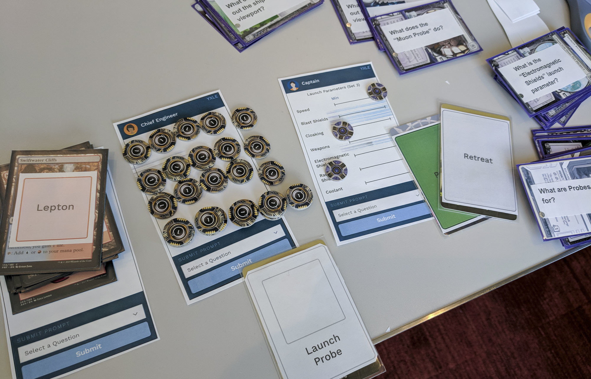
Version 3
We simplified rules, cut the codebase, and reduced the UI from 4 devices to 1.
What worked? Cards. When people could touch physical game pieces, they were engaged with the activity. This needed to be the focus of the game.
The only thing the app really needed to do was serve as an input/output device in response to player actions. With this in mind, we stripped out 75% of the digital game UI functionality.
We also simplified the rules and user roles. Originally, we had created the roles of Captain, Chief Analyst, Commander, and Engineer. In practice, the separation of roles made things complex and negatively impacted gameplay. Omitting this complication made it easier to scale the game to larger group sizes.
Four separate user flows were simplified to a single flow in the game UI.
Randy had noted that there would only be 1 hour available to play the game. We needed to account for this, so we added a time constraint as an optional game factor.
Test Group C
We ran a third test group the following weekend. This time, only a single digital device was needed as an input/output device. In addition, we limited the game play to 1 hour, to ensure that it worked with a time constraint.
Thank you Justin, Nix, Carlos, Jake and Aaron!
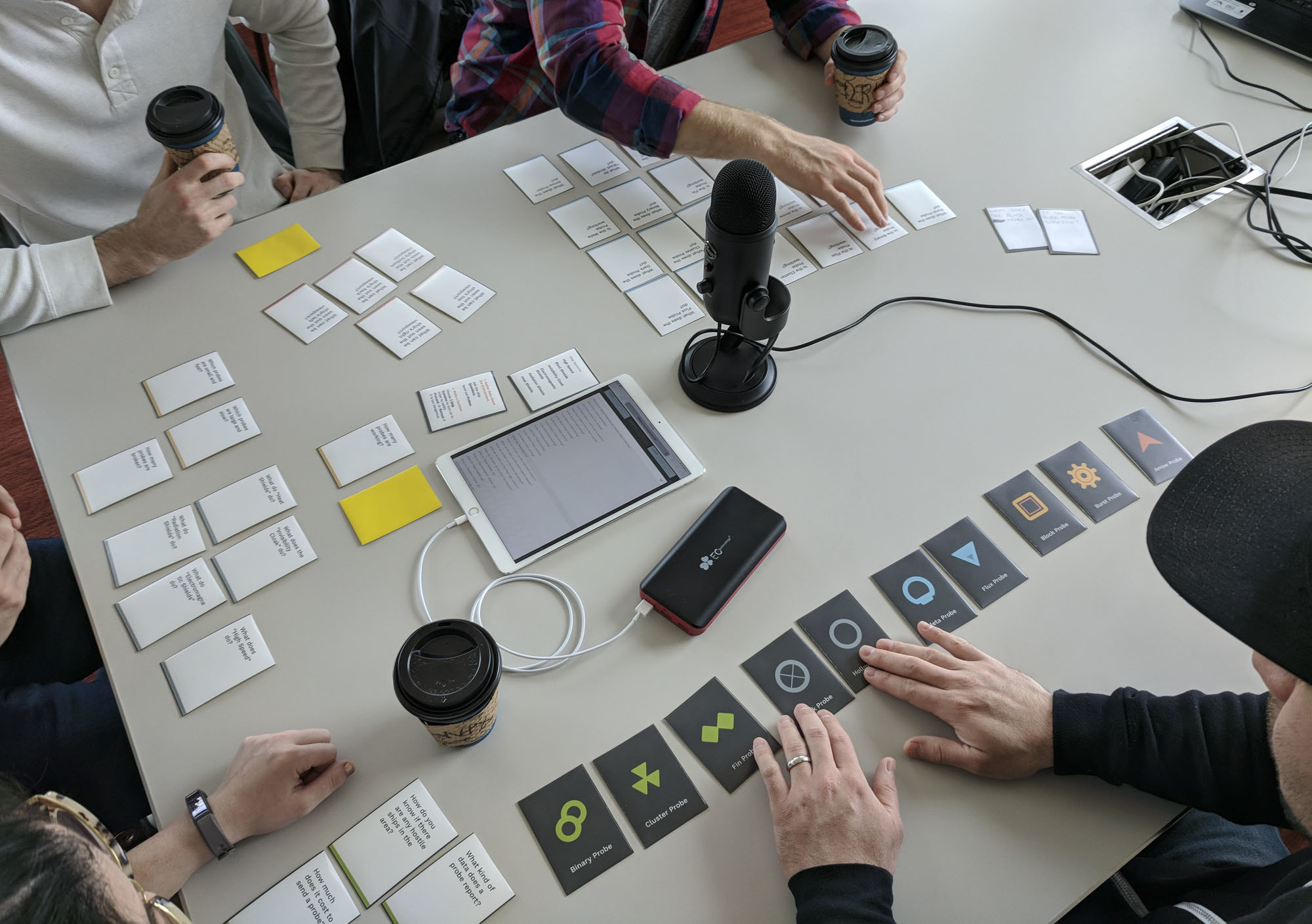
Color strips improved Question Cards, but colored probes still confused players.
The game was successful! It still had the original feel of the first game session, yet the input device eliminated the amount of extraneous pieces needed to play the game.
Things that worked
- Minimal digital game UI.
- Mostly a card-based game.
- Minimal setup instructions.
- With a time constraint, users made faster, definitive decisions.
User frustrations
- Probe colors were distracting.
- Users didn’t realize powercells depleted when actions were performed.
Things to improve
- Remove the color from probes.
- Add a sound or visual alert when powercells are depleted.
- Ensure that the game works offline.
How did we do?
PassedSimplePlayers had very few questions about game setup and objectives.
PassedInferentialPlayers expressed insightful comments at the conclusion of the game.
PassedFlexibleVariable team sizes are possible. An optional time constraint can be added during gameplay.
UnknownScalable?We aren’t yet sure if the game can be easily replicated across multiple groups.
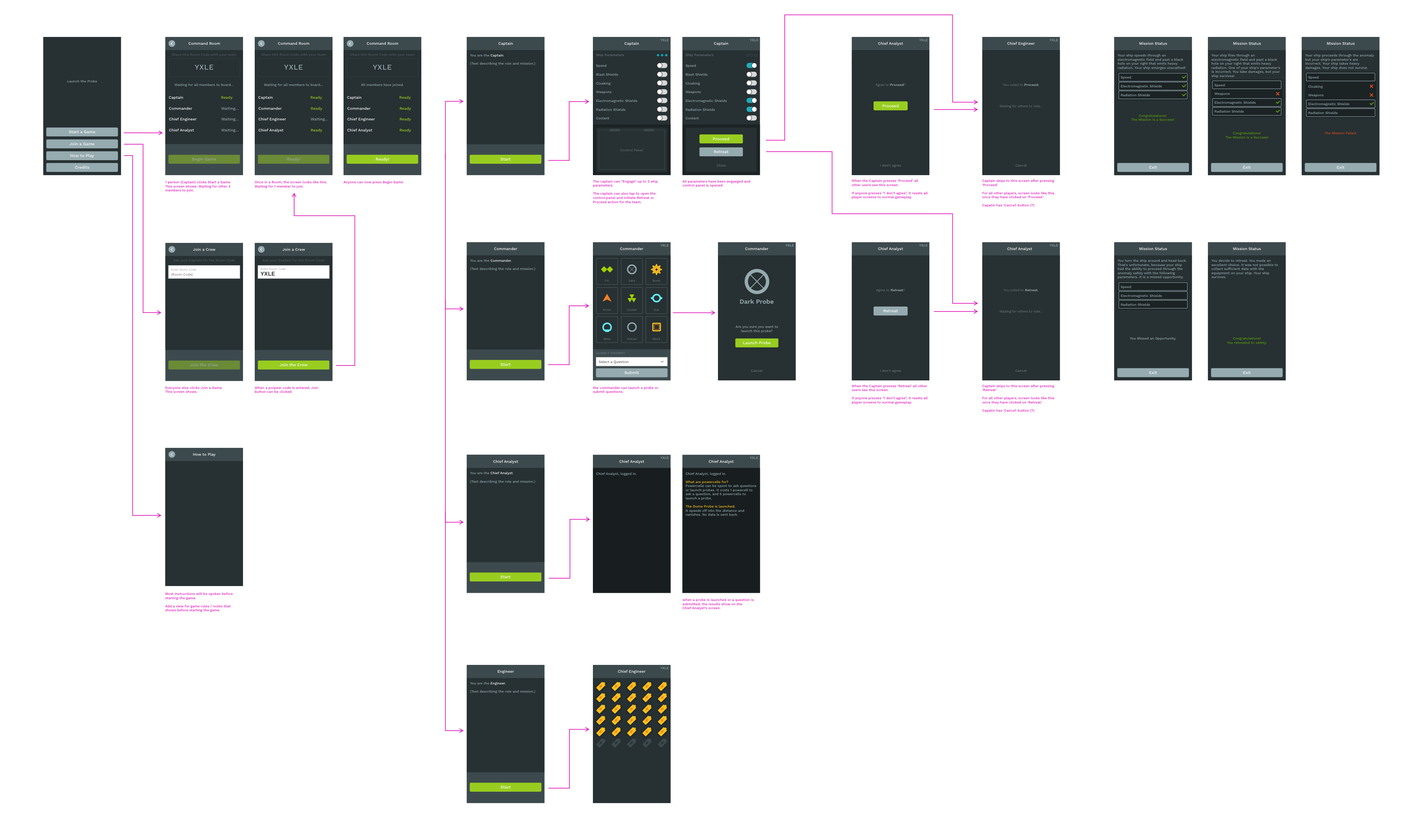
Visual Design & Polish
We shipped the product early!
We had 2 weeks to polish the game. Jon and Te refactored the game UI again, so that it could function entirely offline once it was loaded in a web browser.

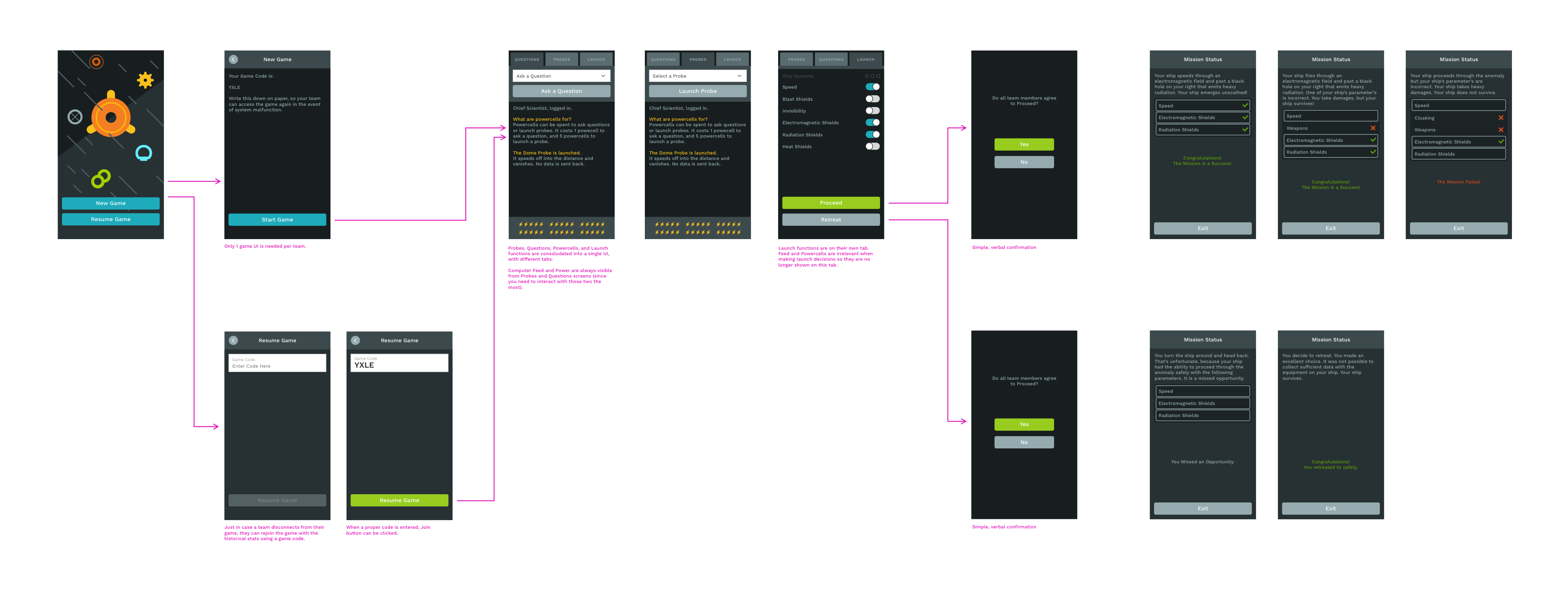
A click-through of the final game UI.
I designed the final game to have a cohesive appearance across both the digital UI and the cards. I printed and mailed several card decks to Randy with 1 week to spare.
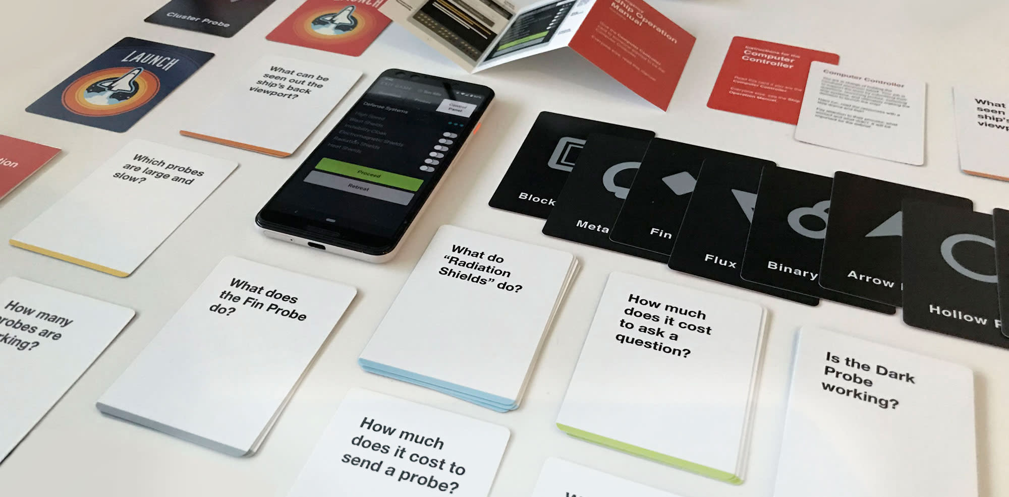
Final game UI and professionally printed cards and instruction insert.
Final Deliverable
We counted down to the final launch.
We held our breath during Randy’s conference. We were in call for technical support, though things must have gone smoothly, because we received no calls. Soon after the conference, Randy called with a report.
In each group, participants organized game materials differently.
It took off smoothly.
Teams sorted cards differently than in our test groups. Often, participants stood around a small round table, so they could all see the game components.
Randy had modified the set up so that one person on a team was selected to be the “Computer Controller” in charge of the mobile device. This allowed the majority of the team members in each group focus on discussion.
Participants generally had an enjoyable experience.
Randy ran the game in a 1-hour time slot for the first game session. In subsequent sessions, he sometimes had to truncate the game to 30-minute sessions. The flexibility of the game format allowed him to do this easily.
We were a little worried that the game may have been too complex. We were only able to test the game on our peers (programmers and gamers), so we weren’t sure if it would translate to a less tech-savvy audience. I had intentionally designed the cards and UI with large type, bold icons and high-contrast colors. It paid off. There were no UI usability issues.
In addition, the game UI was mobile responsive, web-browser-based, and offline-capable, so teams could load the game on either a phone, tablet, or laptop. We thought that a phone or tablet would be easier to manage, though in actual use, laptops were extremely convenient in being able to display information a group setting.
“Amazing that the Board was so wrapped up in the experience. I have never seen them get engaged with an exercise like this. It attracted the engineers and accountants as well as everyone else.” — Arturo Fuente, Board Chair GTE Financial
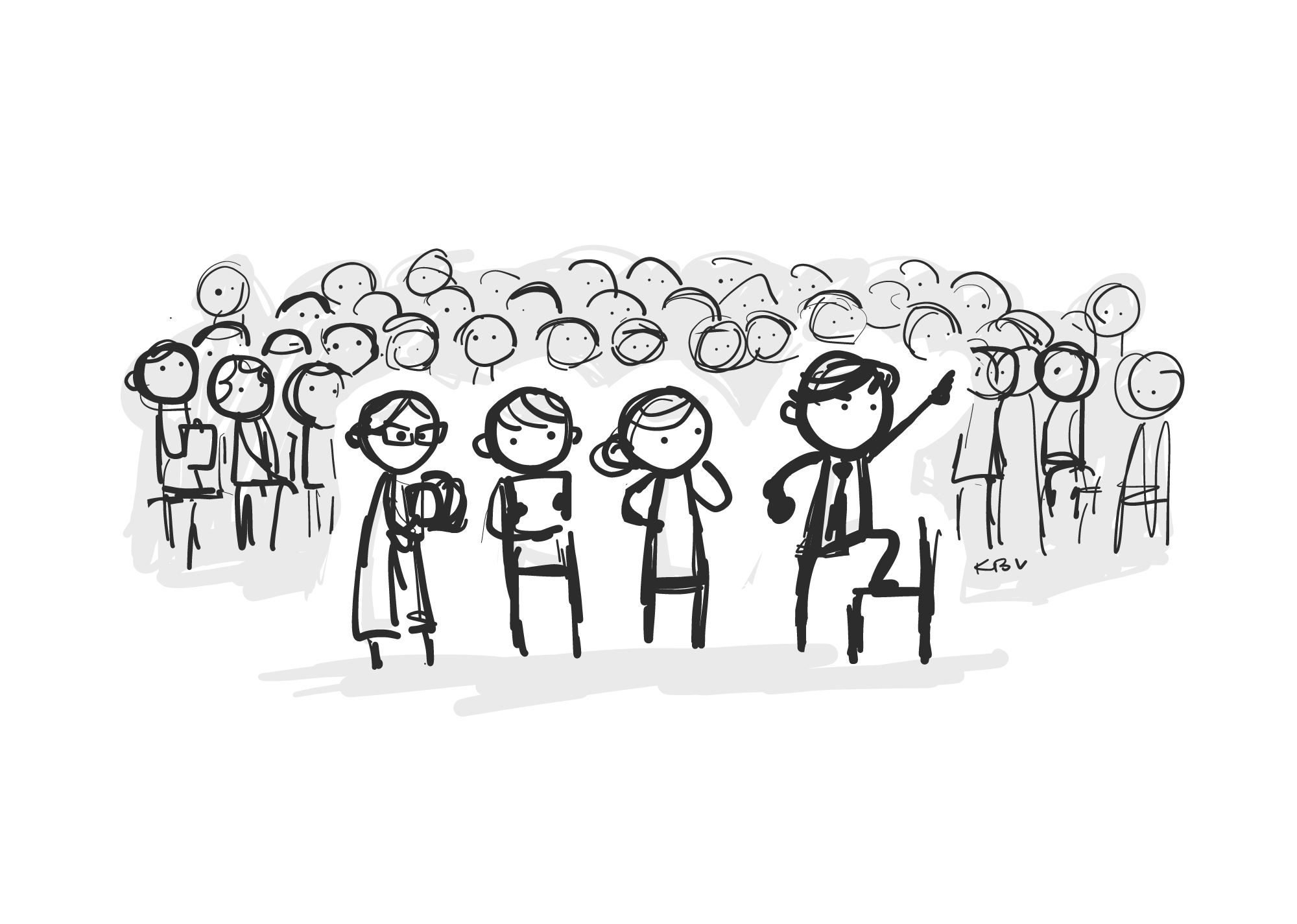
It was thrilling to hear that everything went so smoothly. The game even scaled well to a larger conference size of about 100 participants, each split into teams of 5 - 6 team members.
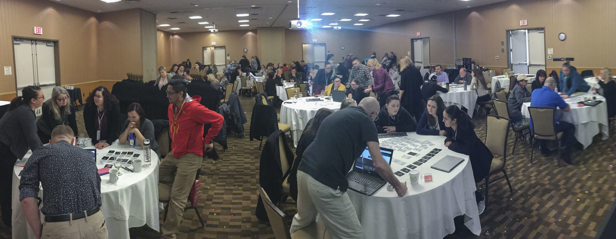
The game scaled easily to 100-person conference.
“People approached the challenge very differently, but somehow they were able to come together at the end with a successful and unanimous decision.” — Kelly Schraeder, CEO IQ Credit Union
It was a lot of work to complete the project in such a compressed timeline. We were exhausted, yet excited about how successfully it was executed!
How did we do?
PassedSimpleNo hiccups in gameplay.
PassedInferentialParticipants connected the game concepts to workshop themes.
PassedFlexibleRandy was able to make up new rules ad-hoc.
PassedScalableThe game works offline. It scales easily to a group of 100 users.
Key Reflections
Frequent user tests allowed us to build a better product.
Instead of sticking to our original game idea which set the stage for a chaotic and stressful game scenario, the final space scenario had evolved to focus on teamwork, communication, and true collaboration.
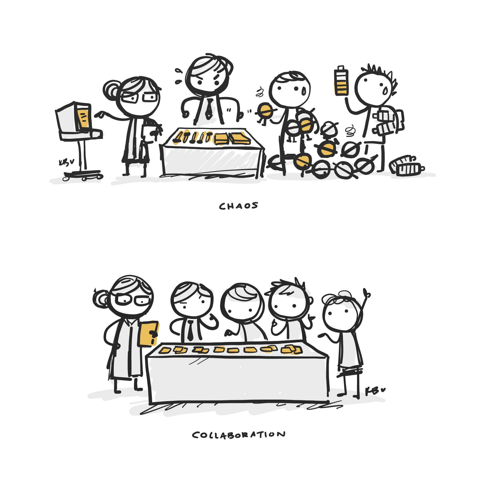
Chaos vs. Collaboration
With so many people involved in its creation, The Launch was a learning process for everyone. Everyone communicated openly and enthusiastically because we were all a part of creating something together. There was no time or space to be attached to anything we imagined, designed, or coded. So, what did we discover?
- We were entrusted to design an end-to-end solution without any constraints. Randy was fairly hands off from the project, and he trusted us to expand on his ideas to create the best possible product with polished execution.
- We were passionate. When we have the opportunity to, we enjoy creating educational and inspirational games. We cared about what we were building and were invested in its success.
- We took ownership of improving the user experience. Great UX was something we all cared about. It was not a single team member’s responsibility.
- We were not attached to the design or code. We trashed 75% - 85% if the codebase by the end of the project, though doing so made the product more effective.
This was hands-down the most creative, fun, and impactful product I have worked on in a while. I think we were successful because we were truly practicing the methodology reiterated in the game: Do research to validate your ideas. We consistently maintained a user-centered mindset that spanned our entire workflow from ideation to testing to software development, and it has certainly shifted the way we build products today.
Thank You
After the first conference, we continued to work on The Launch. The goals shifted to focus on replayability, distribution, and marketing. We worked closely with a bunch of awesome folks at Extreme Arts & Sciences (Randy’s marketing company) to make this happen.
“I would work with you two any time anywhere. I am super impressed with your skill and most importantly your passion and professionalism.” — Randy Harrington, CEO Extreme Arts & Sciences
Extreme Arts & Sciences
Special thanks to Randy Harrington, John Miller, Edwin Song, Ed Larison, Talia Rose, Adrian Leon, Alex Tebbs, Jainen Narain, Cisco Malpartida Smith, and everyone who was either directly involved or available as additional support! Because of everyone’s hard work, we were able to collectively produce a marketing website, marketing videos, and a slide deck.
Playtesters
Thank you also to Alan Solidum, Laura Gonzales, Te Vallee, Jen Fernandez, Justin Hedani, Brandon Bennett, Bob Matcuk, Sean Nakamura, Manny Pilande, Justin Herdandez, Nicole (Nix) Kinney, Carlos Avila, Jake Vissering, and Aaron Prenovost for volunteering your Saturday mornings to be playtesters. It was a blast to work with everyone!