UX Design
National Domestic Workers Alliance
Project Overview
In December 2019, I was tasked with improving the user onboarding experience for the National Domestic Workers Alliance membership website. This organization provides an outlet for domestic workers and caretakers to seek support from other members, obtain access to health and personal benefits, and become leaders in their community in fighting for policy changes at both a state and national level.
For this project, the team had already done some initial user testing and had identified the key pain points experienced by members. It would be important for the new website to:
- Improve Member Sign Up. Potential members were not completing the sign up process.
- Prioritize Mobile. Most members used a phone as their primary internet-connected device.
- Deprioritize Email. Most members did not regularly check their email.
- Leverage Text Messaging. Members responded best to announcements via text messages.
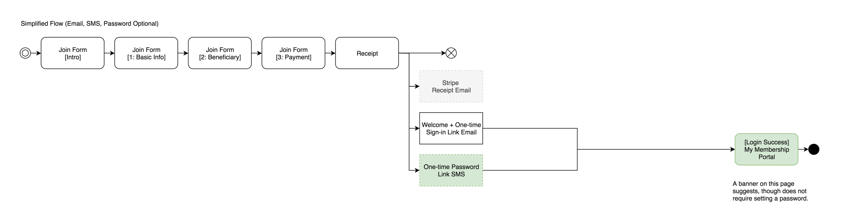
Refactored User Flows
With these priorities in mind, I audited the sign up process on both mobile and desktop web browsers. The audit revealed a lengthy 9-step signup process plus 3 automatically generated emails.
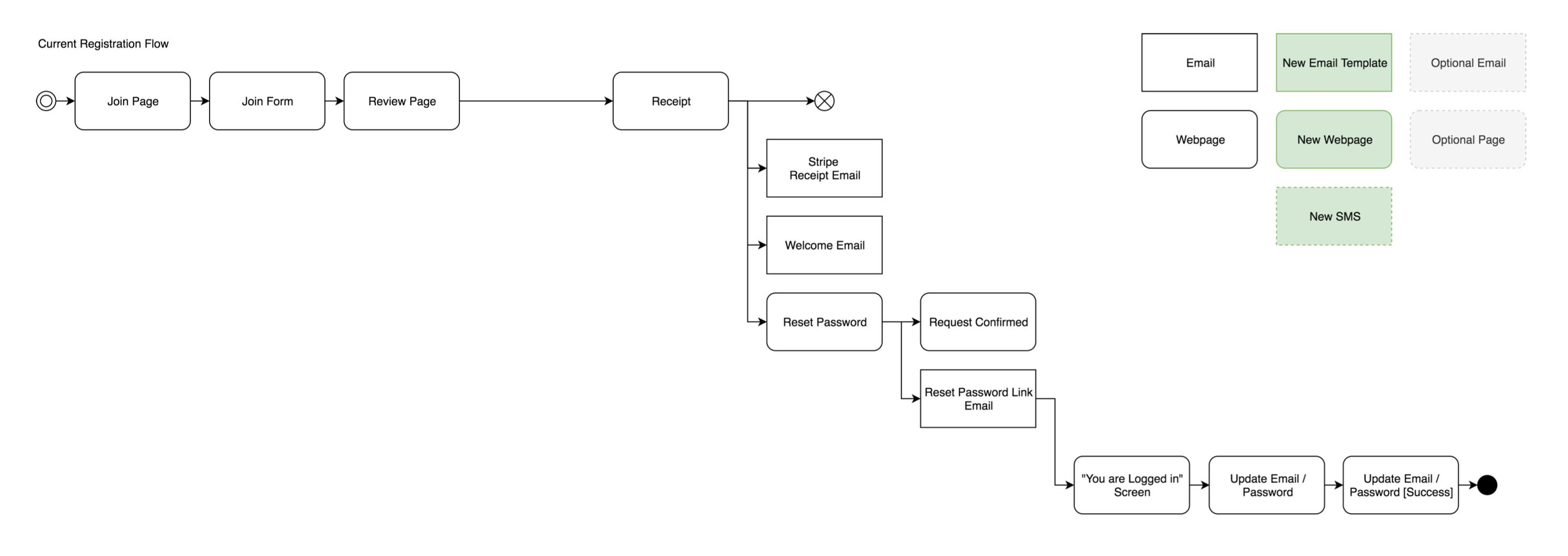
Previous Member Sign-in User Flow
I then mapped out a proposed user flow that could reduce the number of sign-in steps down to 3 web pages, a single email, and a text message user authorization trigger.
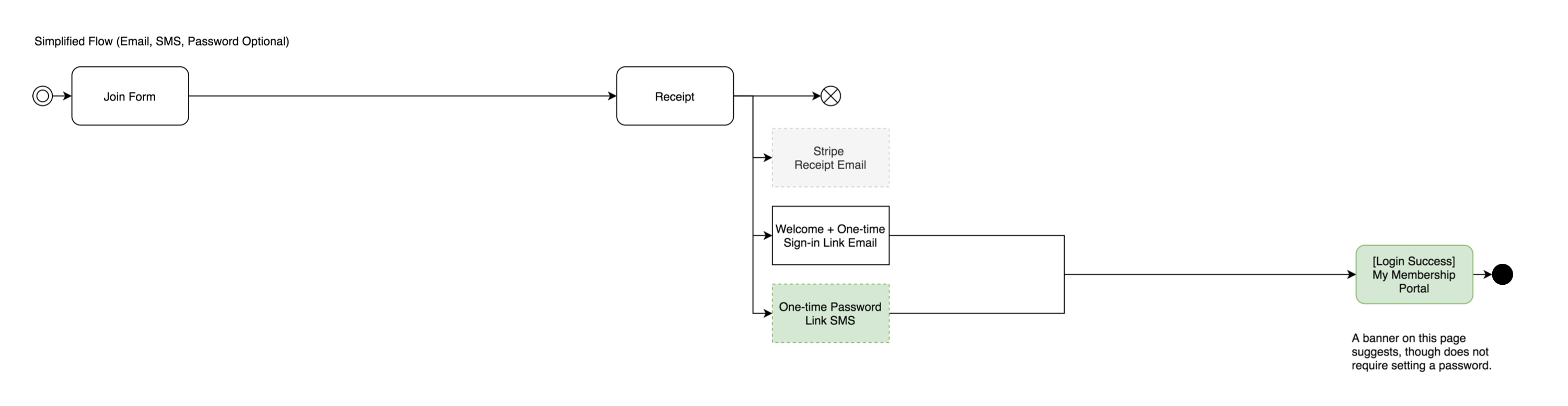
3-Step Member Sign-in User Flow
In addition to providing a text-message alternative for sign in, the proposed "password-less" authentication flow would allow users to access their account without having to remember any login credentials beyond their own email or phone number. I especially emphasized the text-message-based authentication flow, since it meant that users would not have to rely on email for sign in.
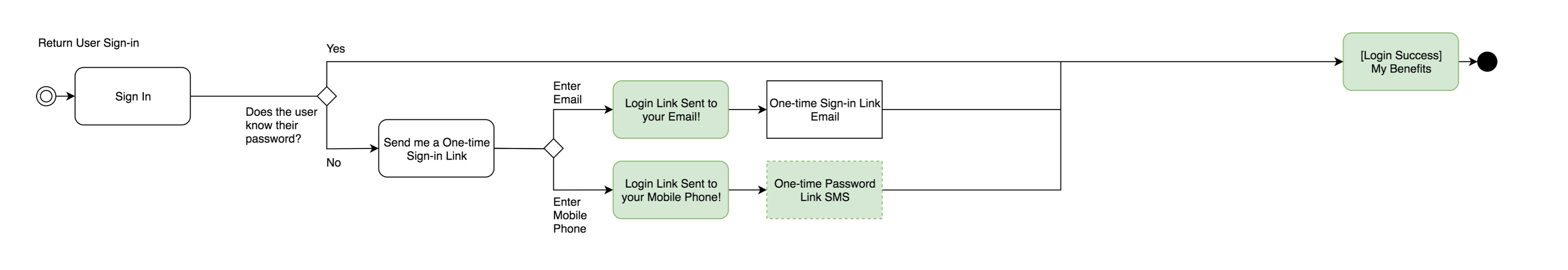
Login User Flow
Mid-Fidelity Wireframes
I created mid-fidelity wireframes to map out the 3-step form flow. I like to initially work in a blue or grey palette, since it strips away distracting imagery and colors when I am focused on laying out an initial page structure.
Mid-fidelity wireframes for the new sign up user flow.
UX Writing
Even though this is just a mid-fidelity wireframe, I do my best to write clear and functional verbiage for all areas of the layout that are core to the user's experience. For this project, it was important to write friendly and encouraging intros for all form sections. Previously, users would not complete the form because they were concerned about why certain pieces of personal information were being collected.
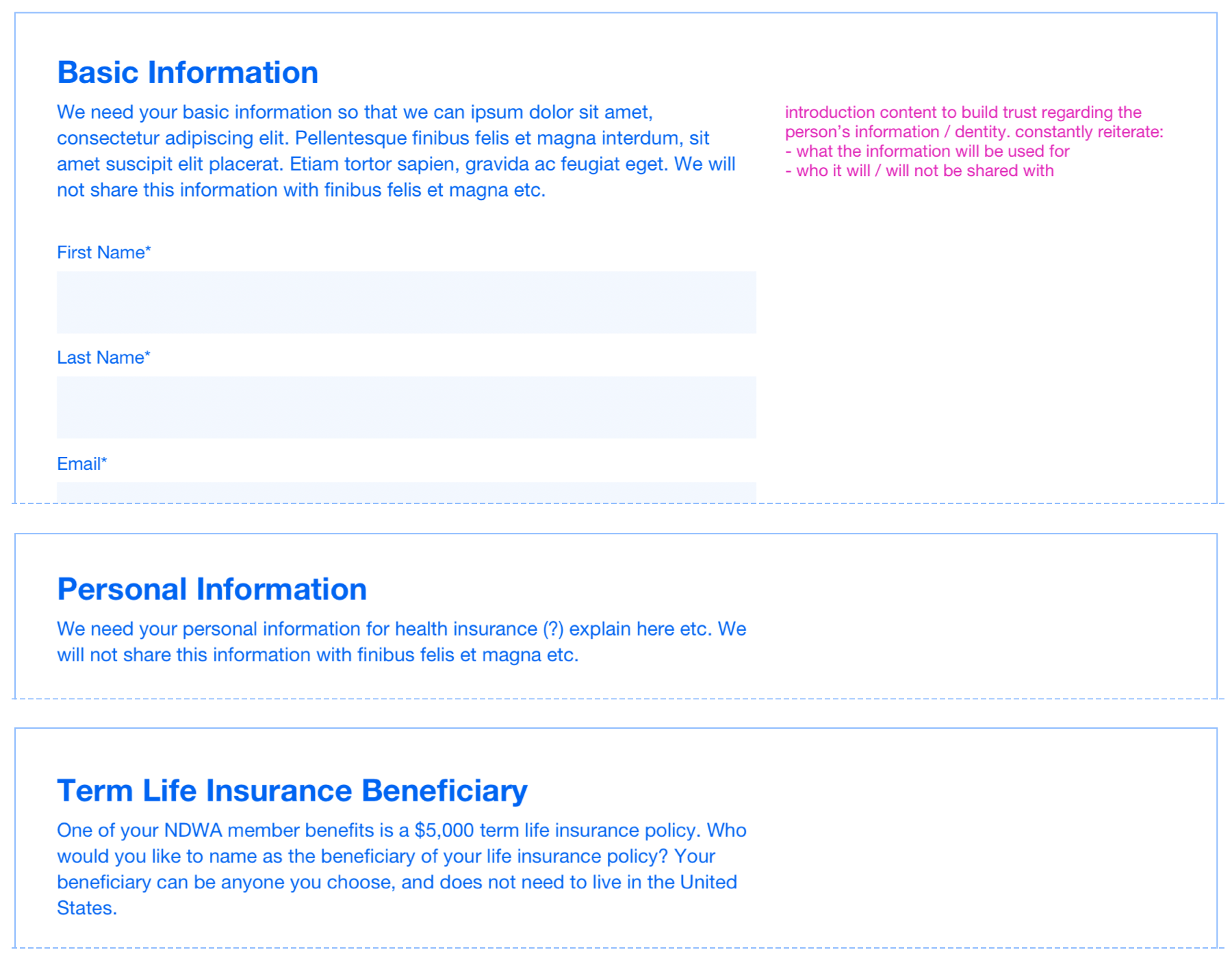
Section intros for the sign up form.
I also examined the language around payment processing. Members could pay a $5 monthly fee through recurring billing, or a $60 upfront single payment. This was an essential option for members who had less stable incomes or did not want to put a credit card on file for an automatic subscription. Previously, it was very unclear how long a subscription would last or how users could extend their membership. In the redesign, I added clearer verbiage to explain payment terms.
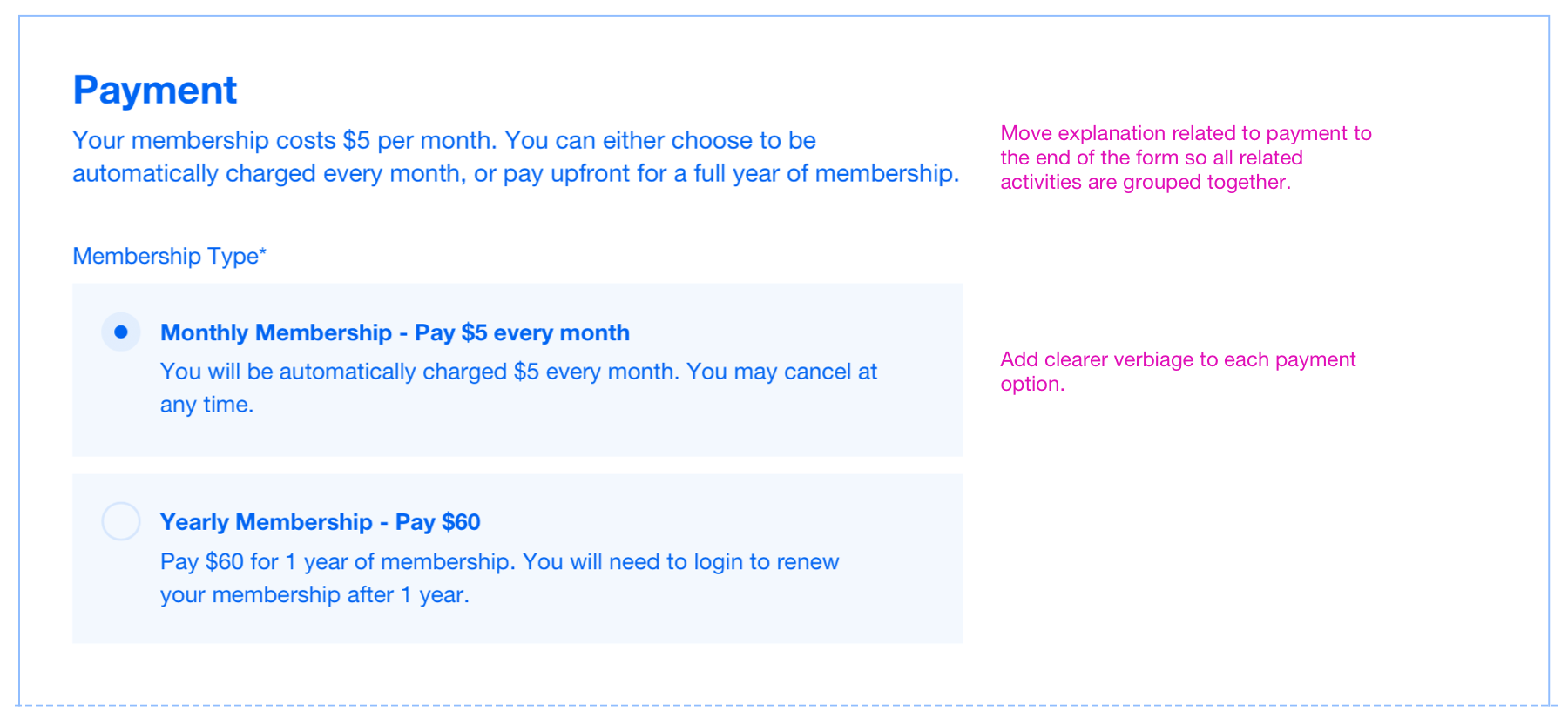
Verbiage with specific details about payment.
Mobile-Friendly Components
A seamless mobile experience was absolutely key for this user experience. Due to the development time constraints, I recommended using unstyled form elements for the sign up flow to guarantee native compatibility with mobile devices.
I also recommended that options should be listed vertically, dates should be dropdowns (not a date picker), and long blocks of text should be textareas.
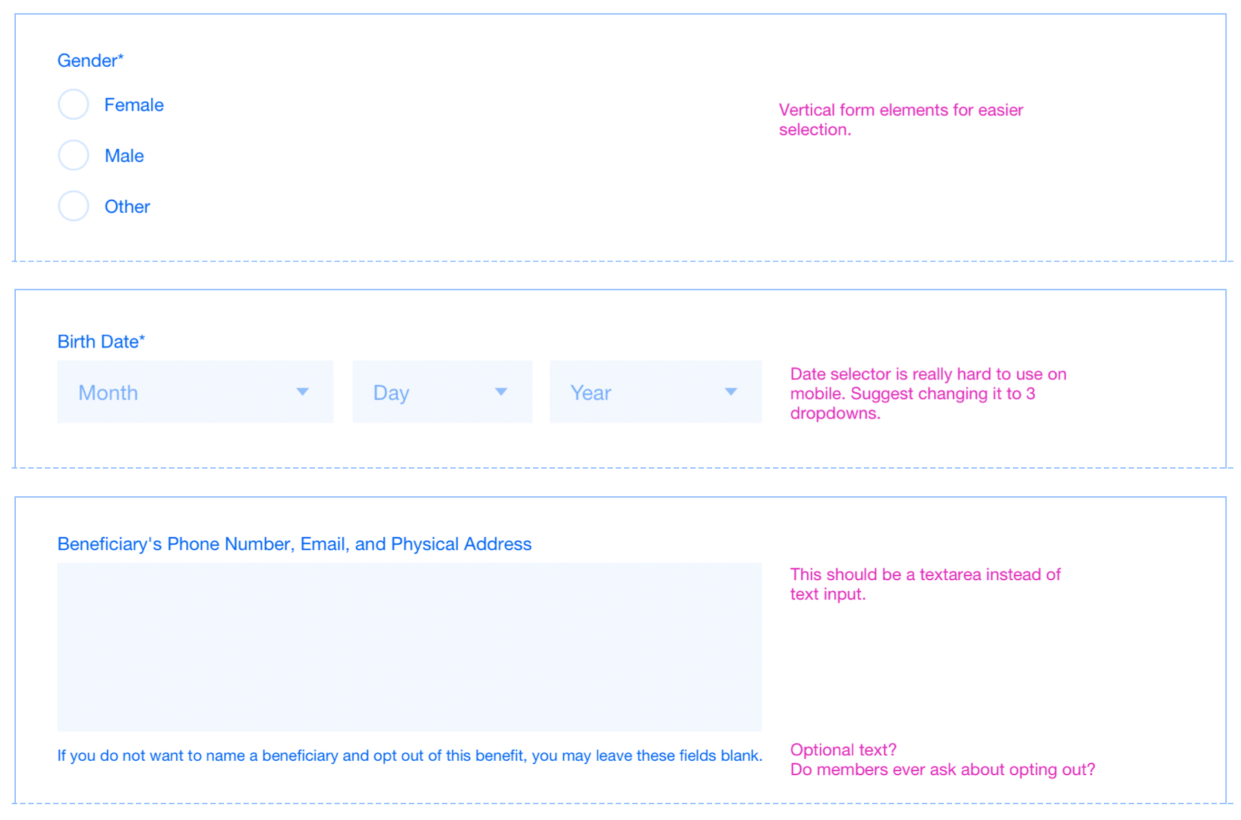
Recommended changes to components for optimal mobile compatibility.
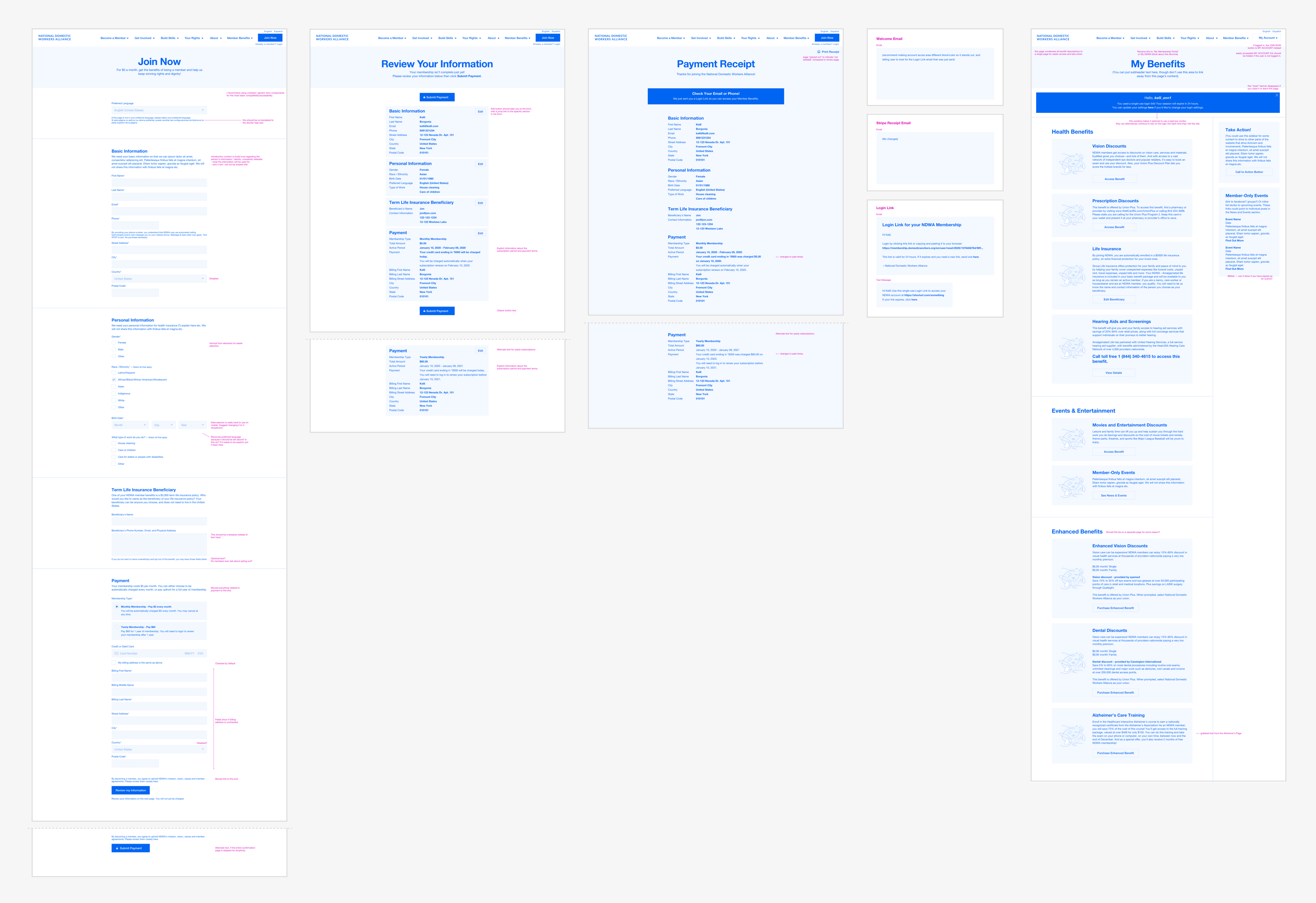
Desktop High-Fidelity
Working closely with the client, it became apparent that the form could benefit from a multi-step flow which would allow the team to be able to track visitor drop-off, and allow the user to process the form in smaller bits of information. This added steps to the sign up flow, though the intention was to give the user more reassurance during the sign up process. I didn't have a chance to this flow, though this is something I would want to test if we had more time.
Multi-step member sign up flow.
Due to extremely tight time constraints, I worked directly with high-fidelity wireframes from this point onward as I designed the multi-step form flow.
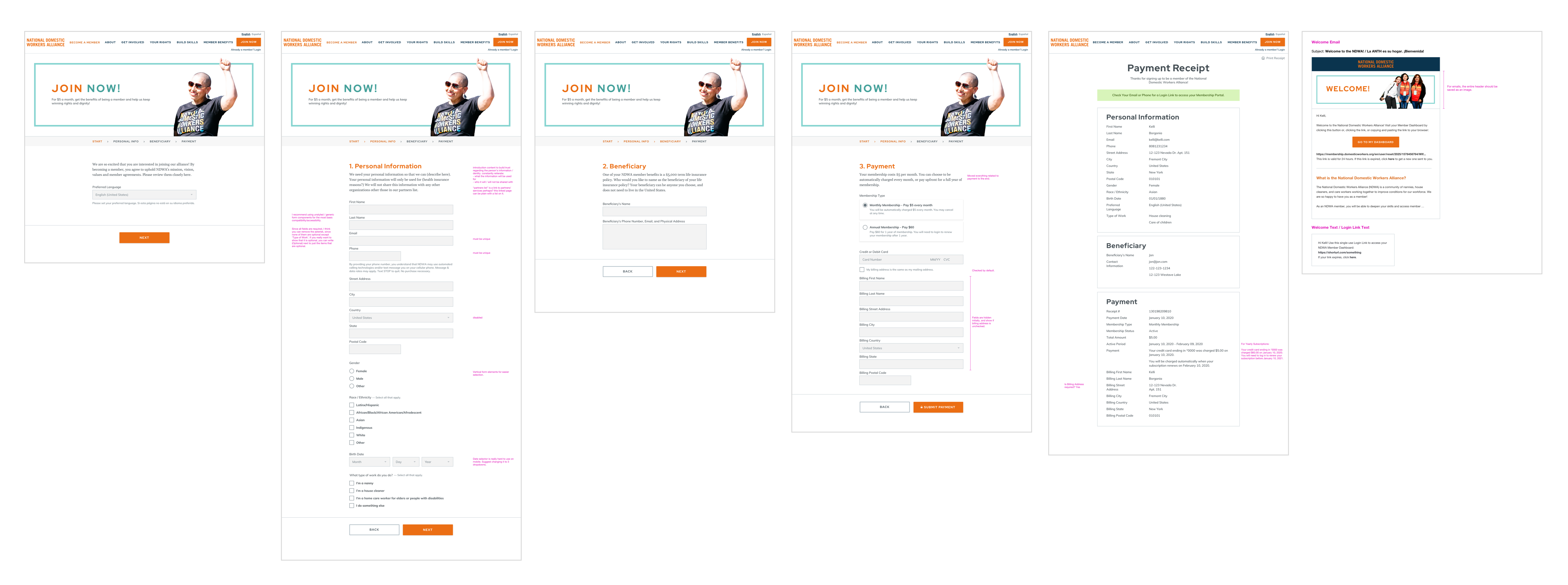
High-fidelity mockups for the desktop sign up user flow.
Mobile High-Fidelity
While scaling the desktop content to mobile dimensions, I realized that the intro (which in a previous iteration was combined with "Step 1") did not scale down to a mobile format very well. I spent some time simplifying the intro text and layout.
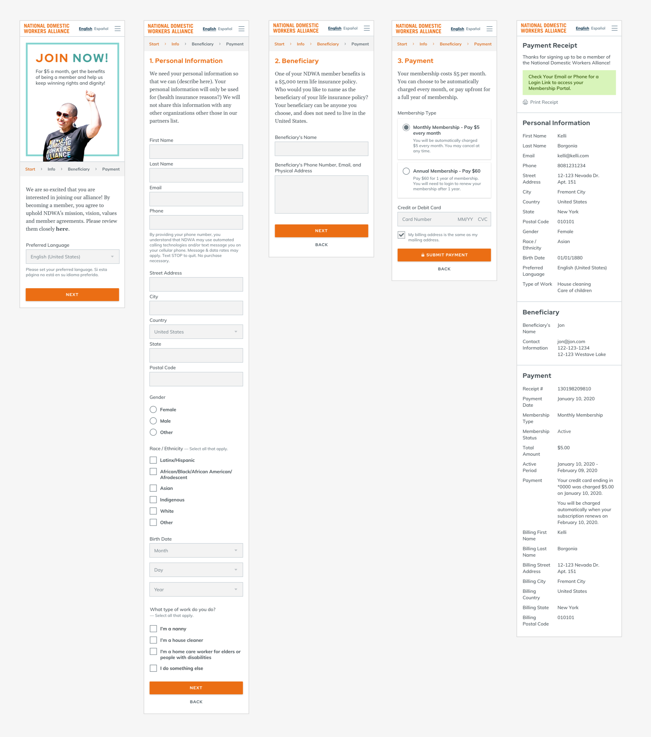
High-fidelity mockups for the mobile sign up user flow.
I always find it easiest to work this way—design for desktop first, then iterate and simplify down to mobile. I think it is important to account for every possible element and every possible state of objects on the page, regardless of whether they are visible or not. Designing for desktop first allows me to imagine a page's most complex state, then simplify to what is absolutely necessary.
Membership Settings & Login
Besides the user sign up flow, I also simplified the interactions for text-message-based user login, the membership dashboard, and settings.
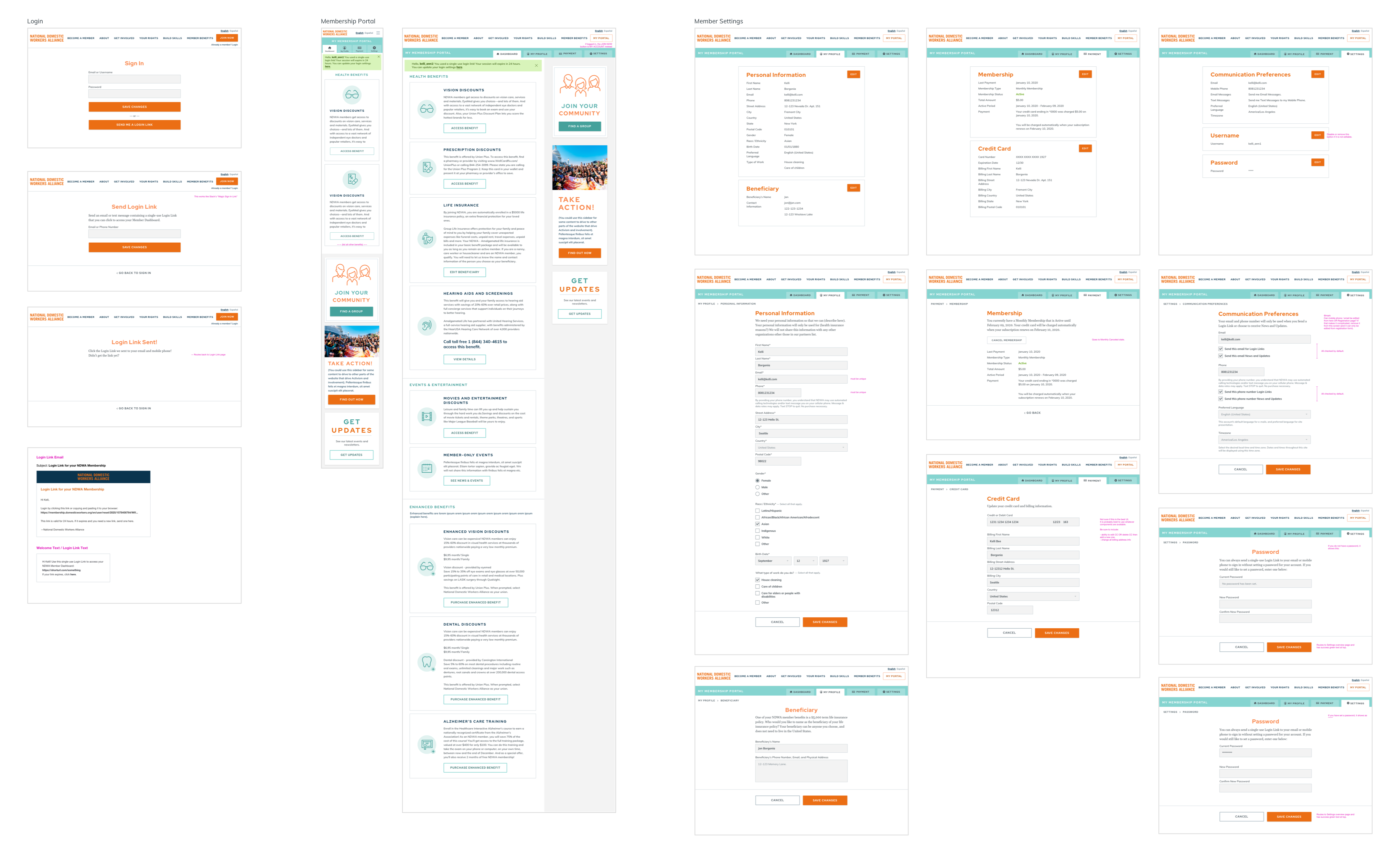
User login, the membership dashboard, and settings.
I especially wanted to ensure that it was easy for members to update and configure their basic membership information. In the previous website, settings were scattered in various interfaces and grouped in unusal patterns due to system constraints. With the redesign, I checked with the developer first to be sure that the design patterns I was establishing were possible to implement. Many of the notes in this section are primarily questions and considerations for the developer.
I also believe it is important to allow people to easily opt out of automatic recurring memberships. I wanted to account for specific state changes to be sure that users had a seamless experience:
- Canceling a monthly membership
- Restoring a membership that was canceled
- Canceling an annual membership
- Renewing an annual membership
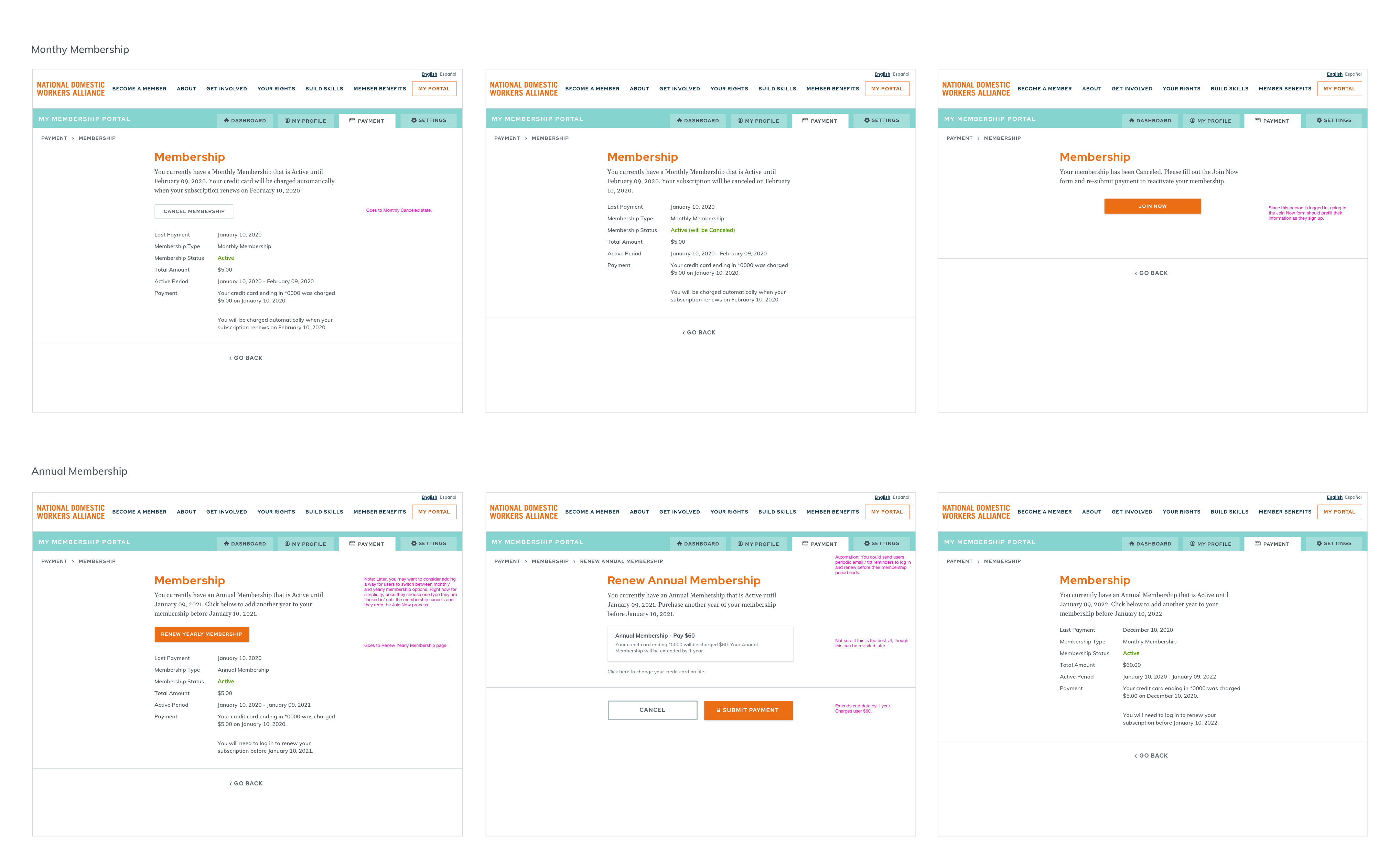
User flows for canceling and renewing memberships.
During this process, I also mocked up iterations showing:
- Switching from a monthly membership to an annual membership
- Switching from an annual membership to a monthly membership
As I worked on these state changes, the user interactions became confusing and complex. They also represented edge-case scenarios that were unlikely to occur, so it didn't seem worth the time and effort to implement them. Sometimes, things can be implemented with a non-technical fix. In this case, if anyone wanted to switch their subscription type, they could cancel their existing membership then restore it (as a workaround).
Visual Design
I was fortunate that the organization had a large archive of high-quality member photography. Using photos as key imagery, I created a vibrant color palette and utilized clean, bold imagery to highlight members in action.
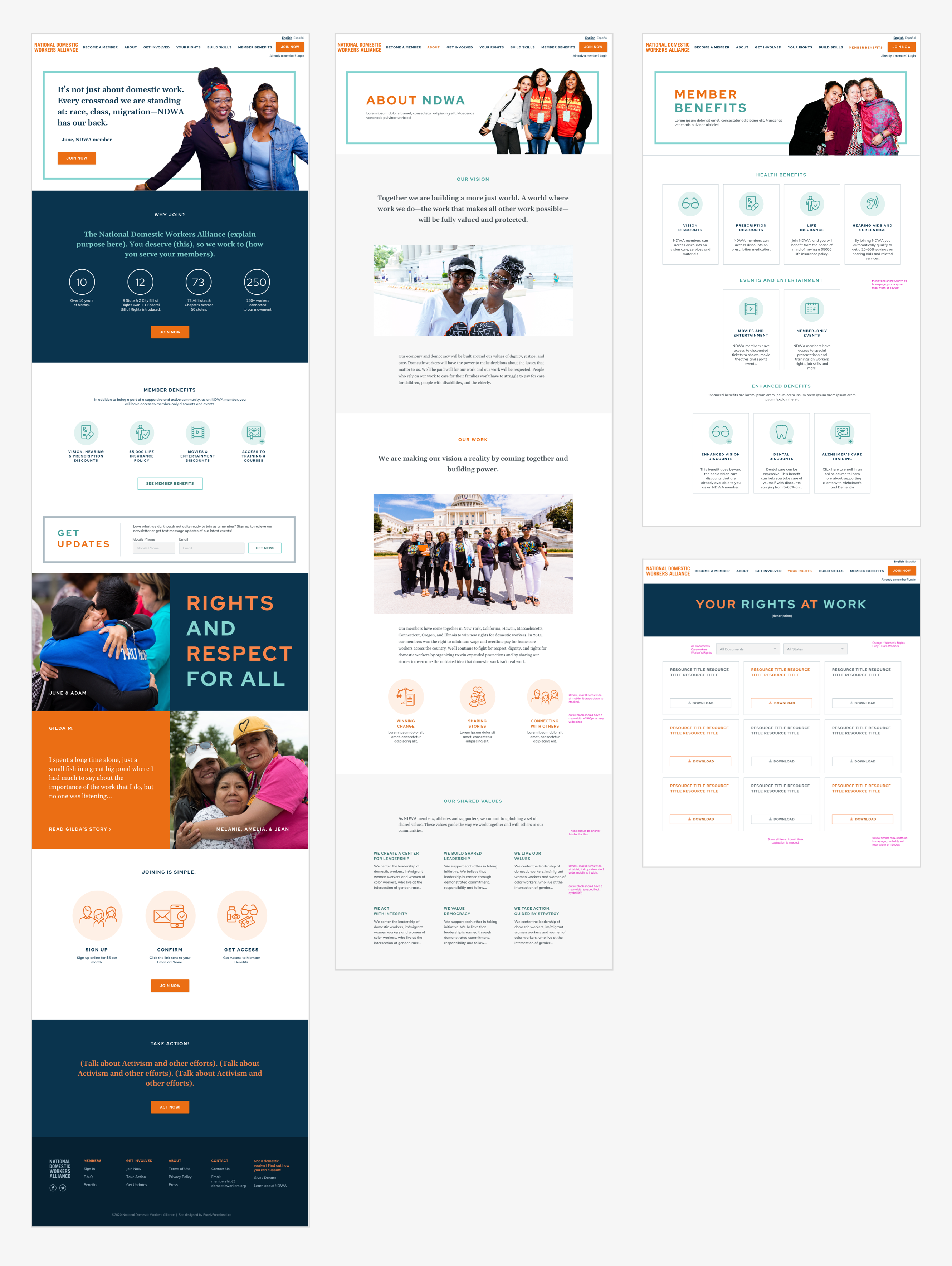
Homepage and several key marketing pages.
I also gathered a set of icons and rendered them to have a consistent color palette and stylistic treatment.
Icon Library for NDWA Membership.
Accessibility
I haven't paid as much attention to accessibility in the past, though now that my interests have shifted to UX, I want to get better at designing accessible experiences. For this site, I checked the contrast of elements and made all the blues and oranges slightly darker so that I could ensure at least a AA accessibility rating for all functional elements and text. Wherever possible, I also made body text a pixel or two larger.
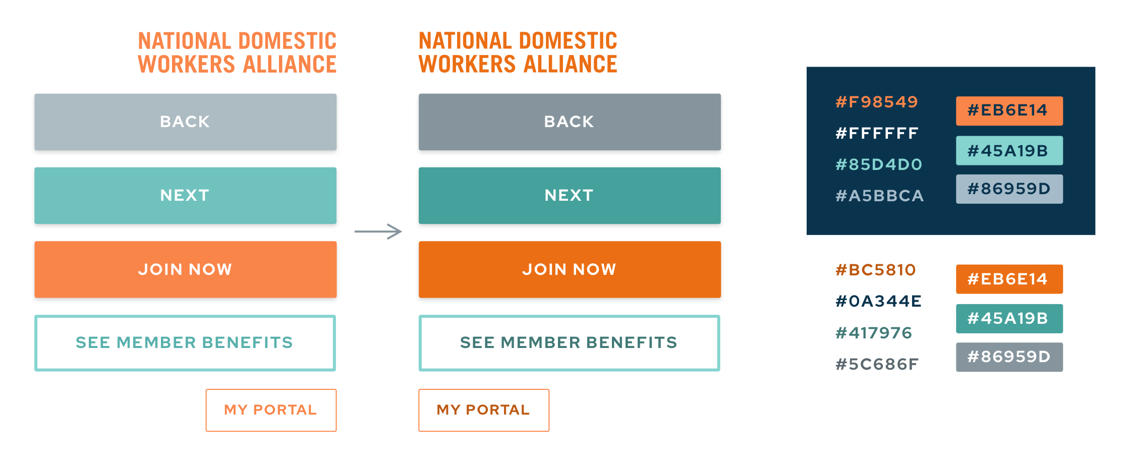
Increased the color contrast for WCAG 1.2 AA Accessibility.
If I was coding the pages myself, I would ensure that there was tabbed navigation, proper semantic stucture, and labeling. Since my scope of work ended with visual design, implementing all other accessibility measures relied entirely on the web development team.
Asset Handoff
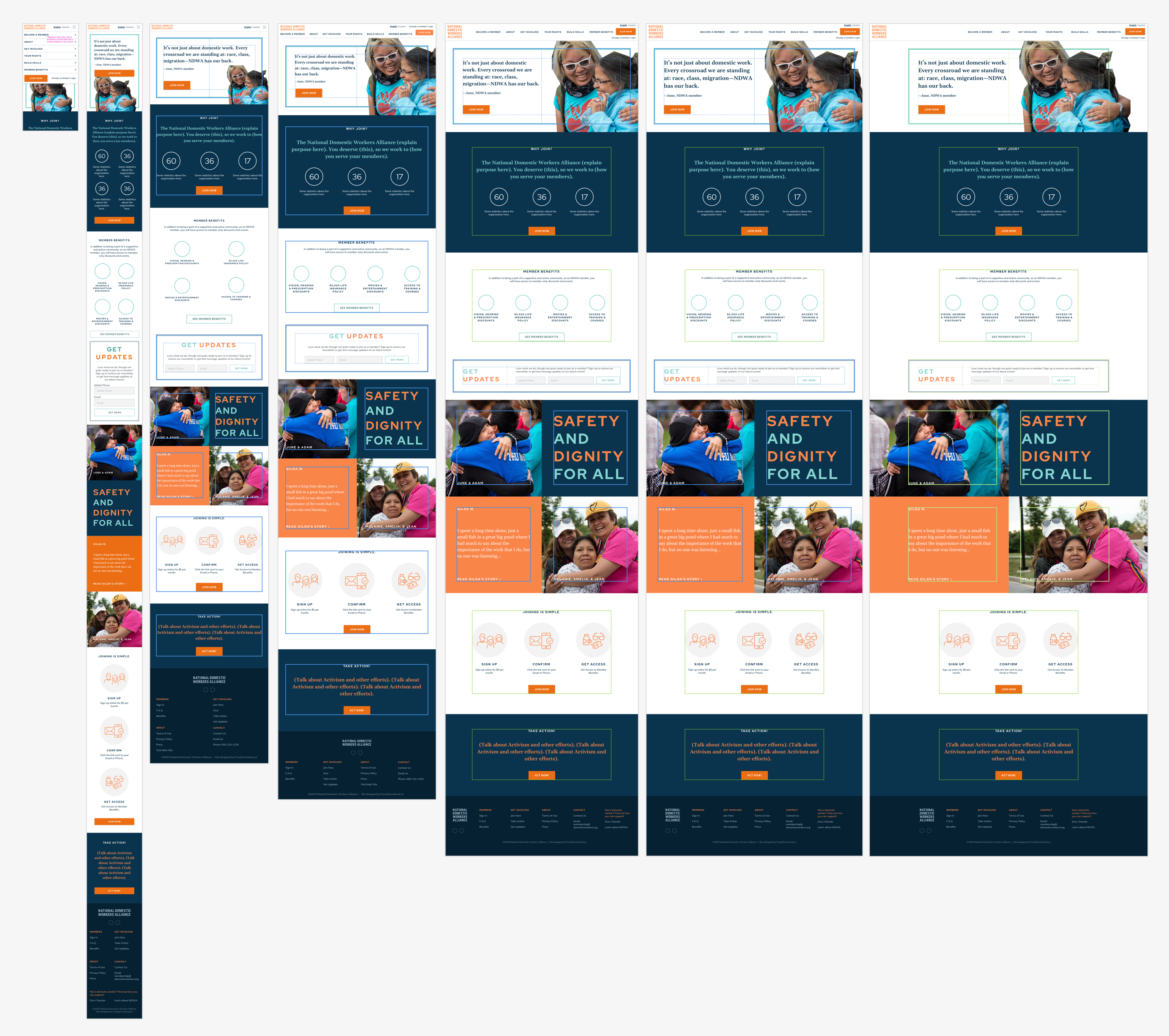
Usually, I'm the person implementing the markup and styles for a project, so I don't need to spend time creating scaled versions of layouts. For this project, I wanted to be sure I handed off a good set of instructions to the developer, so I added markup to indicate the intended sizing and spacing at various screen sizes. Note that the image used in the header was just a roughly cut placeholder and the intent was to show how elements shrink, expand and flow when transitioning from mobile to larger screen sizes.
How did we do?
The entire project was completed within a 2-week timeframe. I believe I successfully met the key objectives to improve member sign up, prioritize mobile, deprioritize email, and leverage text messaging. Unfortunately, I won't have measurable results until there is a quantifiable increase in membership numbers. Later this year, I will be able to report the results of the redesign.
What did I learn?
Whenever I work on a website, I usually do everything including project management, requirements gathering, flowcharts, wireframes, visual design, custom graphics, HTML / CSS layouts, and developer management. This was a refreshing project, where I primarily focused on UX, then handed off assets to be implemented by the development team. I think this project revealed several key insights for me:
- It felt extremely meaningful to work on a project that had a social impact. If the redesign is sucessful, more people will be able to join an organization that fights for greater access to basic human rights.
- The project doesn't feel at all like work since the team was supportive and everyone shared candid feedback.
- I love information architecture. When switching between UX and UI for this project, there was a drastic difference in how natural it was for me to think about data structure, verus how much more effort it took to think about visual design. I love aesthetics, and I think both skills are important, though this project certainly revealed that when I am challenged to solve a technical design problem, I can make a greater impact on an organization.