UX / UI
Flight Plan
About the Project
In 2019, I designed the UX / UI for a hypothetical airline ticketing platform. Unlike most contemporary websites that return hundreds of flight options for price-conscious flyers, this experience targets users that value a laid-back and hassle-free journey more than a cheap ticket. Built during a 24-hour hackathon, the web app pulled realtime flight information from Expedia along with airport congestion data in order to display a single round-trip ticket suggestion for the leisure-seeking traveler.
The UX Concept
We spent an hour coming up with a concept and sketching a few notes to build upon. In typical web development, this process usually happens over days or weeks.
The idea for the UI was very simple. Users would enter in their flight dates and destination, then the app would do the rest of the work.

Sketches of the three app screens: Input UI, Loading, and Results.
We spent some time brainstorming environmental factors that might contribute to a person's travel itinerary. We sketched out an algorothim that would factor in a user's sensitivity to price and travel time.

Notes on important environmental factors contributing to air travel.
Look & Feel
When establishing an aesthetic, I like to start by choosing a typeface. This usually takes anywhere from 30 minutes to 2 hours. During a hackathon, that's a really long time. However, I think it is an extremely crucial part of my design process and it sets the tone and personality of a product. I wanted to use typefaces that were as "bouyant" and "delightful" as possible.

An audit of possible fonts to use.
I chose to use Soleil as the primary typeface for it's extra tall x-height and round, geometric letters, and Bree as a secondary logo typeface.
I expanded on the motif of "blue skies", and sketched a rough color palette:

A sketch of a possible color palette.
I got my inspiration for the illustrations from the quirky characters in the Headspace app, and from the character Alfur, a stick-figure elf in one of my favorite cartoons Hilda.

Alfur, an elf from the cartoon Hilda.
In terms of UX inspriation, I really love OpenCare, the platform that allows you to book a dentist in a matter of minutes through their delightful, simplified UI.

I love OpenCare's simple UI.
Dropping placeholder Headspace illustrations into the UI along with my selected typefaces and colors gave me a look and feel that I liked:

A mockup of the UI with accurate colors and typography and a borrowed illustration.
I quickly sketched my version of Alfur, then created final art with a color palette that matched the UI.

Character illustration sketches.

Final character illustrations.
If I had more time, I would create smooth vector art and animate the characters with CSS. These illustrations were done quickly in about 20 minutes in Adobe Draw, then cleaned up in Illustrator.
The final core piece of the UI was my favorite. Airline ticket design is something print designers always drool over as a wishlist typography project. I jumped at my chance to make it a reality.

Mockup of Itinerary.
I created a quick 5-minute mockup of the results/itinerary layout which would feature a huge pair of round-trip airline tickets, then the traveler's full itenerary. Since I was short on time, I just used blocks of color to indicate text in a layout. I would finalize the verbiage in the actual implementation.
The Final Product
The UI was definitely a collection of things that I really wanted to create as a designer, though I think it all came together nicely and with focused purpose. I'm extremely proud of this project as a fun, visual showpiece that was completed in less than a day.

The user enters in their destination and trip duration.

Results matching the user's preferences are retrieved from Expedia's API, and results are filtered based on the algorithm comprised of the user's travel preferences.

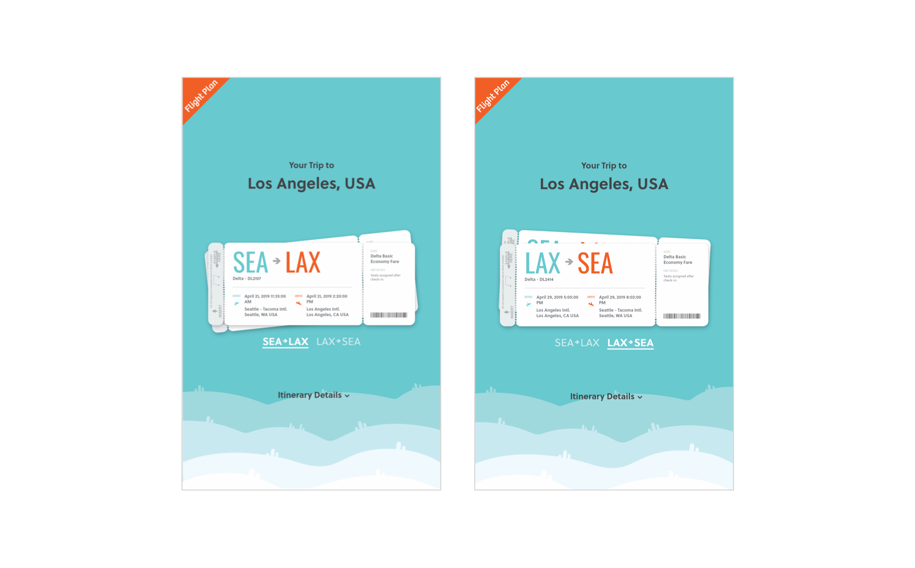
A single set of round-trip tickets is displayed. Below the tickets is the user's entire itinerary starting from their commute from home to the airport, and ending with their return commute home.
What I Learned
I had so much fun building Flight Plan. It was just Jon and I at the hackathon, though it was so fun to be able to build a tiny, fully complete project over the span of a weekend.
Unfortunately, we had so much fun building that we didn't put enough time into our final presentation. The non-technical judges favored the presentations with exposition and slide decks filled with hypothetical business plans. It was disappointing, though now we know what to expect at this event.
Nonetheless, I am proud of what we created. I think it is a solid demo.
In the future, we intend to compete again with a different idea. Next time we will be equipped with a full team including a presenter, a UX researcher, and people who have actual airline industry experience.